Almost a year to the day, we broke ground on the build out of the Vintage Rug Shop storefront. Though I shared a little peek of the process on the blog, I was going a hundred miles a minute in that season of life, balancing ongoing home renovations, client projects, and the store opening.
Looking back, it was a hell of a project, and one I’m still incredibly proud of. We built out the entire space in a little under three months. Tight timeline? Check. Designing a whole home experience, complete with living room, kitchenette, and bedroom? Check, check and check.
It was an dust-filled, nail-biting couple of months before we opened those doors, but I’d be lying if I said the thrill-seeker in me didn’t love every dang minute.
Today I wanted to dive a little deeper into how we found the space, the design process, and some lessons learned.
Sometimes you just need a literal sign to push you in the right direction
Let me take you back to February of last year. Just a few days after my dad passed away, I was riding in a school bus with my son’s class on a field trip. As we drove through downtown, I saw a man putting up a ‘for lease’ sign in the window of a building I’ve always loved.
Only three months prior, I had quit my corporate job to take The Vintage Rug Shop full-time, but I was already starting to feel the itch to do something even bigger. When I originally drew up my five year plan for Britt Interiors, I had planned to open a retail/office location in year 2-3. A physical storefront was the horizon, but definitely not on my radar–until that moment.
One of the ways I deal with grief is putting my body and mind into motion, and that for-lease sign was the match that lit the flame. Side note: you’d think that the terrifying state of my home office would’ve been the tipping point, but I had managed to willfully ignore that for months.
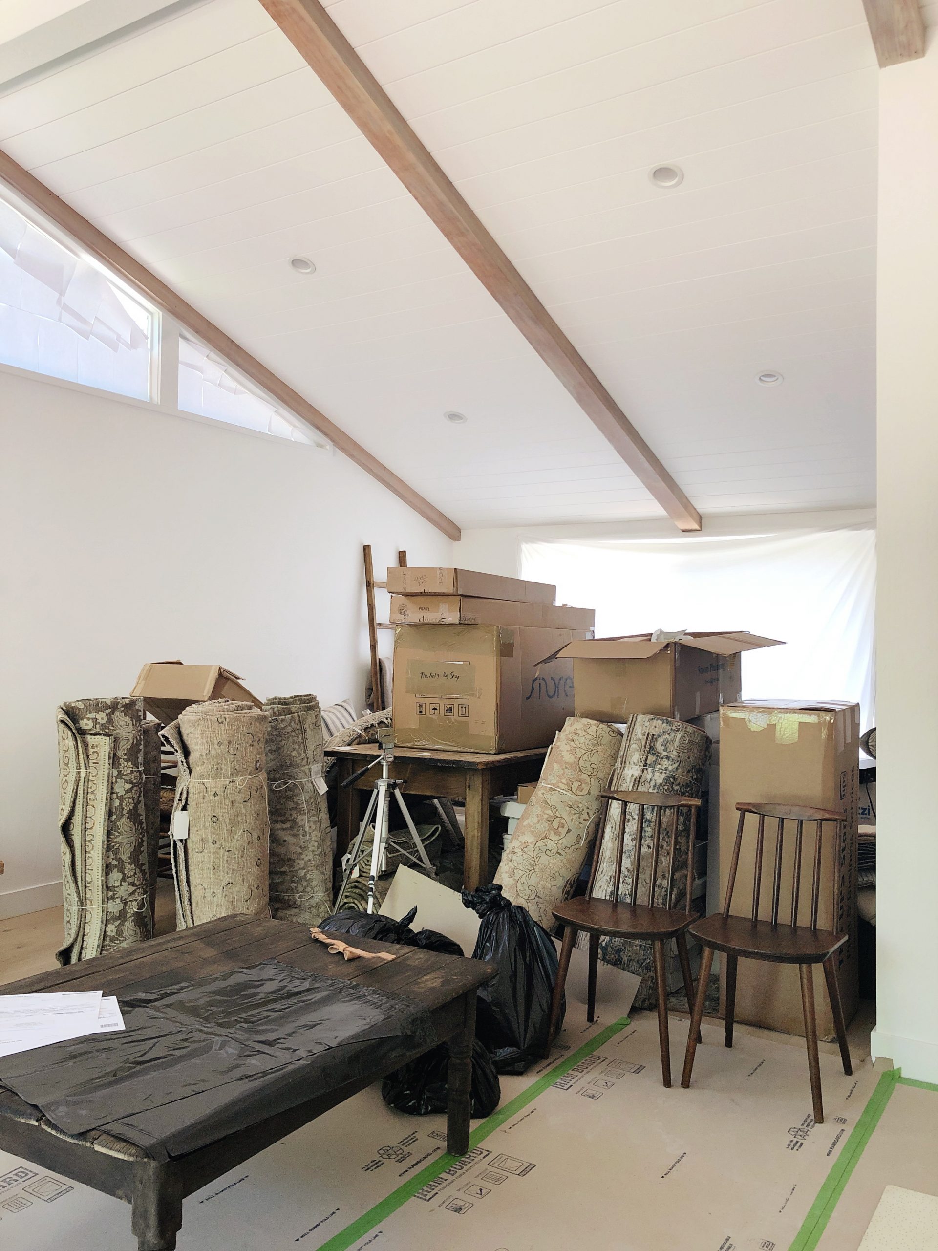
After the field trip was over, I hopped into my car and drove all around town, writing down the addresses of each available retail location I could find. I spent the next few days putting together my business plan and fine-tuning my financial projections. The creative in me is all about throwing caution to the wind and following my gut, but the finance nerd loves a good financial forecast. It’s all about balance, baby.
Hitting the pavement is still the best way to scout for store locations
That whole driving around town thing? I was surprised to learn that was really the most effective way to find lease locations for the store. There are sites like Loopnet but not all available retail locations are publicly listed. More often than not, they are listed directly by the owners, many of whom prefer to work directly with the potential renter. That’s actually the case with the space I’m in now–and I doubt he would have chosen to work with me if I’d been communicating through a broker.
Trust the process
Then, I began negotiations on what I thought was my dream retail space. Ultimately, after an extremely painful and lengthy back and forth with the property broker (a story for another day), it fell through. I was gutted. To drown my sorrows I went to grab lunch at Bakesale Betty’s in Oakland–one of my all-time favorite comfort food stops. As I got in line, I noticed the space right next door to her was for lease. WHAT. I nearly dropped my keys–and my phone.
So, sandwich in hand, I dialed the number on the sign with shaking hands. The landlord answered after only a few rings. I told him I was interested in the space for my brick and mortar location, and he paused and asked, “Any chance you’re available to see it right now?”
Five minutes later, I was touring the space. Every fiber of being knew that this was it.
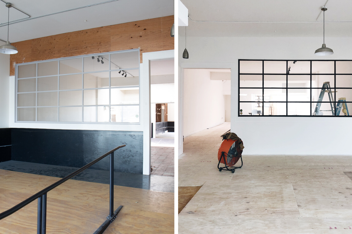
The building has had an interesting history. It was an Aikido Studio for 15 years, then a fitness studio for a couple years after that. What was previously a mirrored wall had been taken down to the studs. Quite frankly, it was a hot mess. But it was my hot mess.
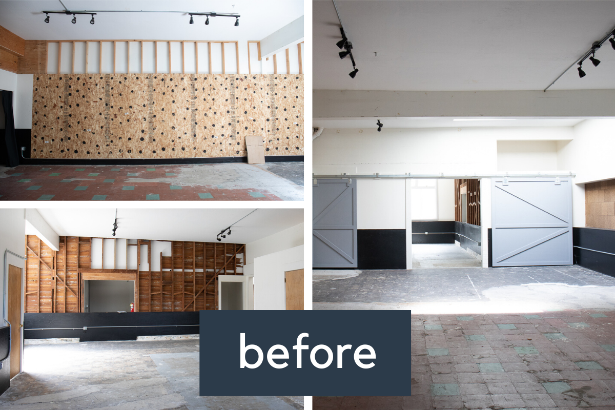
After an anxious few weeks, I finally got the call that we had secured the space, and on May 1st 2019, we broke ground on the project.
You won’t regret investing in flooring
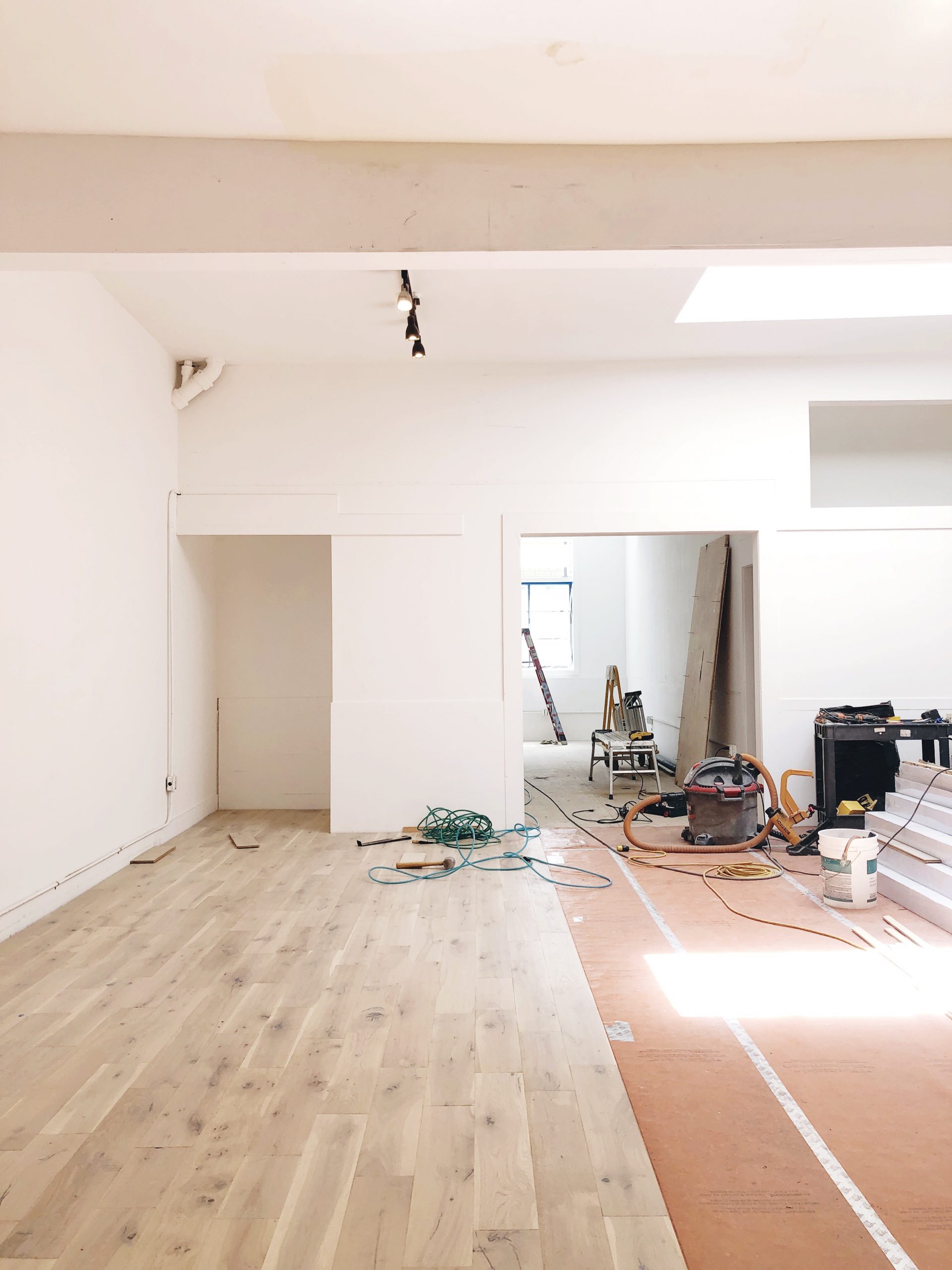
The floors were a mix of asbestos tiles, rugged concrete, and plywood. One of the biggest investments we put into the space was installing hardwood floors throughout. I remember my stomach flipping when we got the original estimate. But I knew solid oak floors would complete the look of the store. We had to do it.
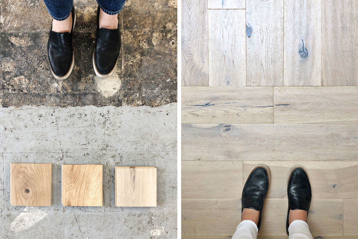
I went with Build Direct because they sell final runs of beautiful hardwoods at a more affordable cost—almost like the Nordstrom Rack of flooring, ha.
Pre-COVID, not a day went by without a customer stopping to admire and compliment the flooring. And truly, has anyone ever said they regret investing in a quality hardwood? Nope. My beautiful rug babies love it.
A fresh coat of paint–and new wall detailing–does wonders
We all know this to be true. Well, all of us except for the people on HGTV’s House Hunters.
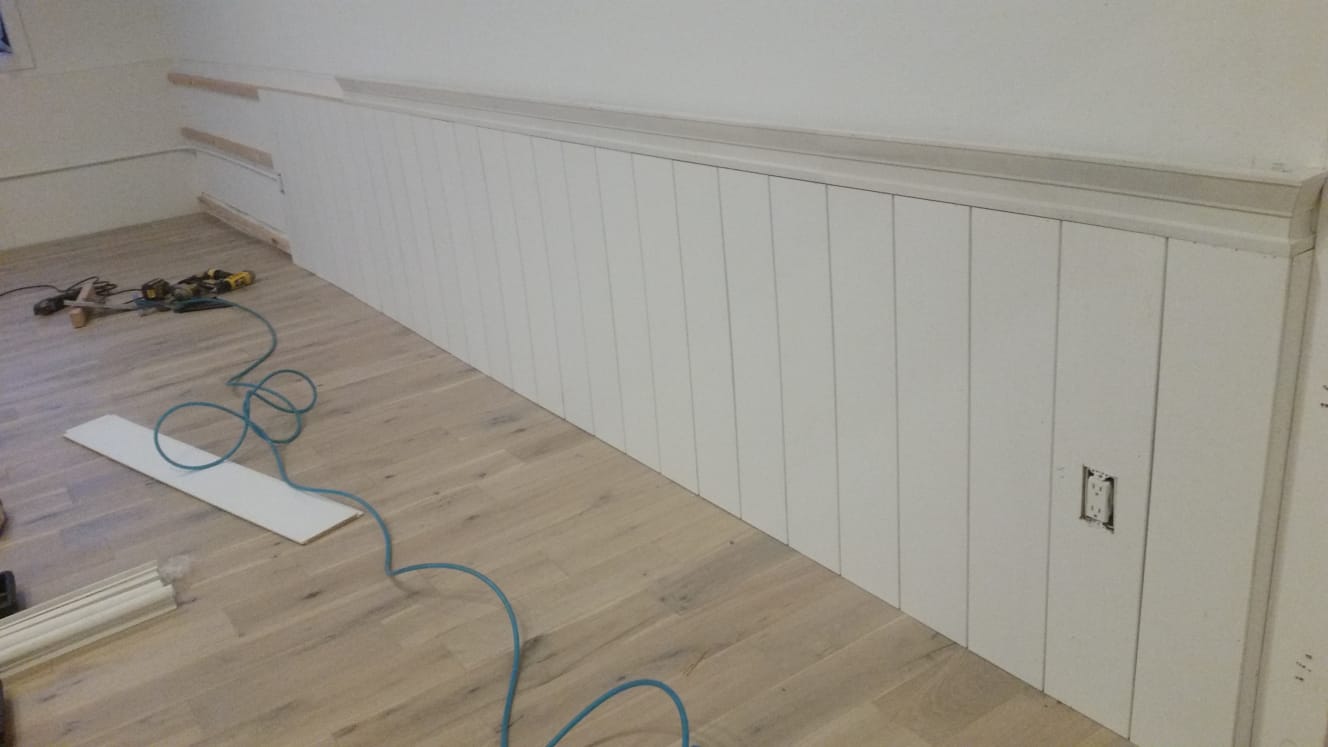
We went with my favorite white, Benjamin Moore Chantilly Lace, on all of the walls. We also choose vertical paneling across the back wall and behind the cash wrap to create a neutral but textured backdrop.
Leaning into the existing architecture
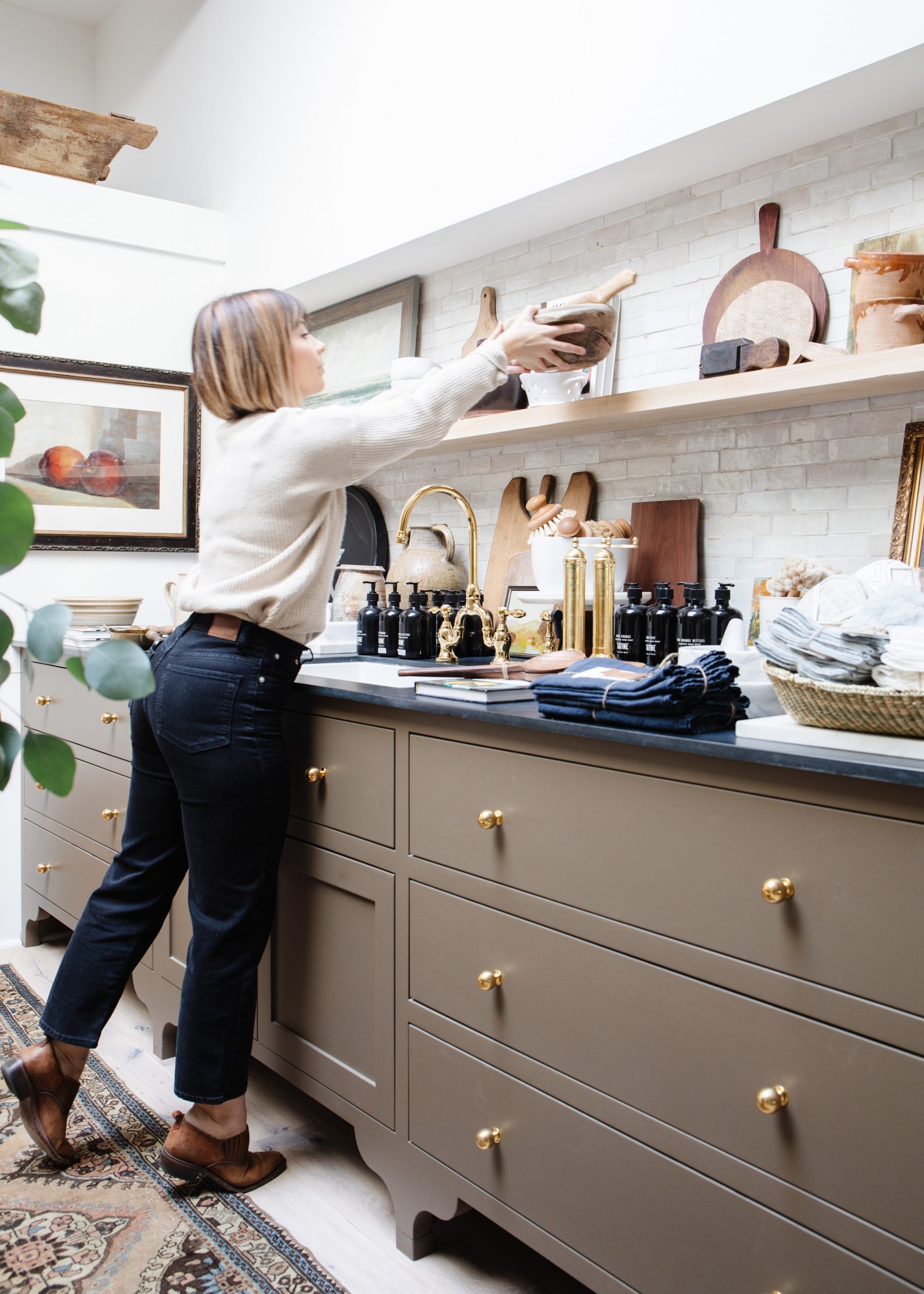
From the beginning, I knew that I wanted the store to feel like walking into a home, with distinct spaces for a living room, a bedroom, and a kitchenette.
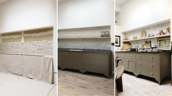
When we did the first walkthrough, there was a wall cutout that had lived a previous life as a bulletin board. It was in a sorry-looking state, with shedding bits of paper and cork. My contractor suggested we fill it in, but I wanted to maintain some of the quirks of the original building, and knew it could be the right dimensions for the store’s kitchenette display.
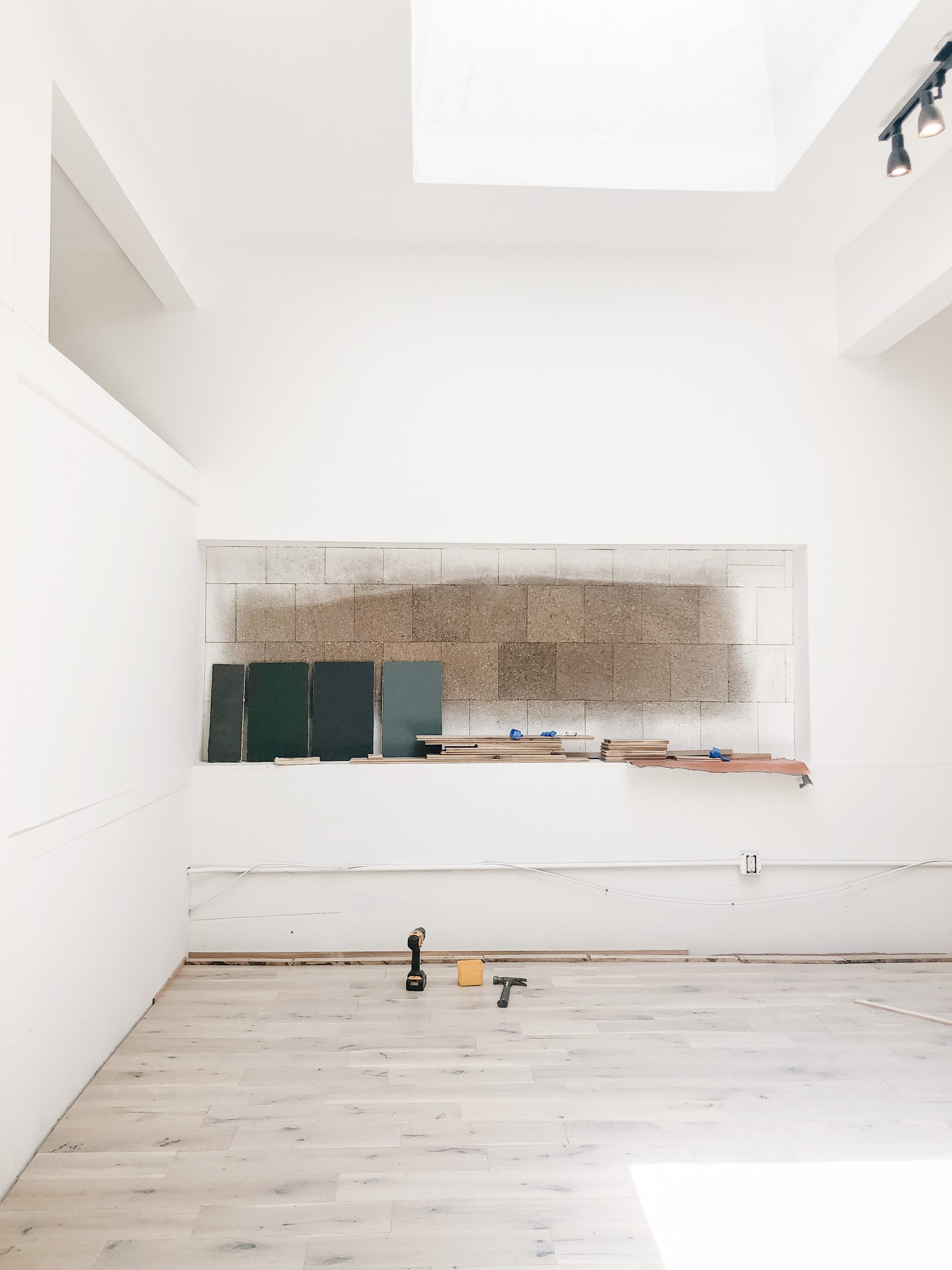
I had this vision of creating a backsplash and installing a floating shelf in the center and got to work designing the cabinetry with our cabinet maker.
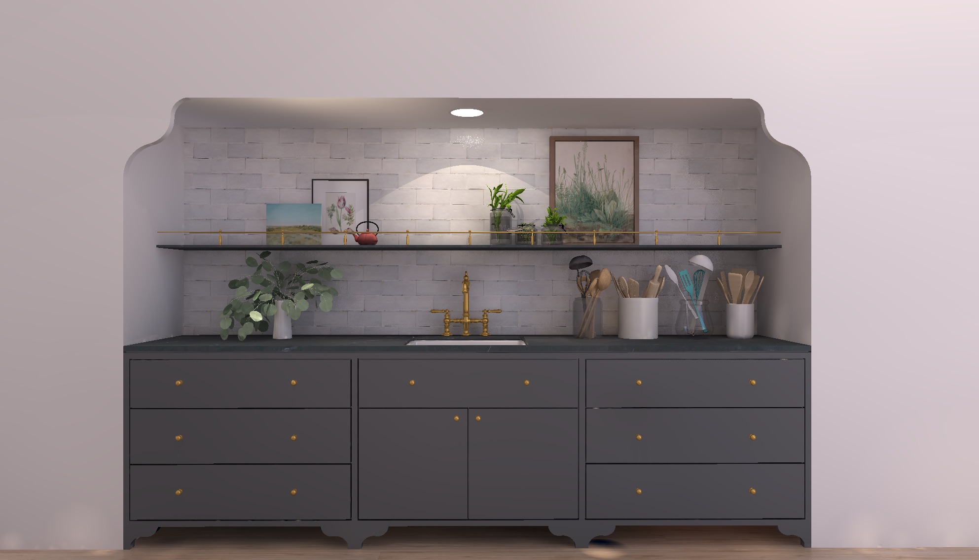
This was the first rendering I did for him. I actually love the way it turned out even better than the original design. That backsplash is Cle Zellige Tile in weathered white, and yes, it was love at first sight.
We also kept the original window added by the former tenants. All we did was paint the wood trim black, and it was ready to rock. It means we have filtered light pouring all day long from multiple directions–aka every photographer’s dream.
Selecting a paint color? It’s always all about the lighting
I agonized over the colors for the kitchenette. Originally I was planning on a blue or black palette, but nothing specific was really calling to me, and my favorite color fallbacks just weren’t working in the space. So I got ten different samples from Farrow & Ball, painted them on scraps of wood and leaned them against the kitchenette wall, desperately hoping one of them would pop.
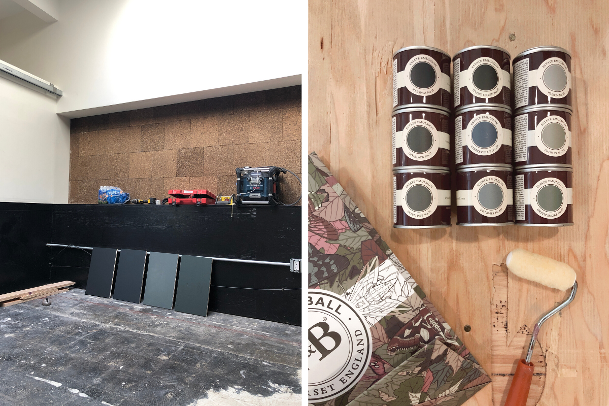
The kitchenette sits directly under a massive skylight, which I didn’t really account for in the color selection process. In that saturated light, all of the darker colors looked straight black, and all of the shades of blue looked too bright. Wayyyy too much pop.
But was on a deadline and had to deliver paint to my cabinet maker. So I went to the paint store to order my paint, hoping along the way I would just make a decision. But instead, I spent an hour in the paint store, holding samples of muddier colors, instead of the blues and blacks I had samples of.
Then, on a whim, I picked up Salon Drab, which was far muddier–like, nearly brown–than any of the original colors. And that was it.
I didn’t even get a sample, I just went with it! Life on the edge, designer edition.
The Before’s, The After’s and everything in between
We love a shiny before and after around here (who doesn’t?), but I specifically wanted to include the messy progress shots. As a designer, I often find those to be the most inspiring. When a project is at that near-complete, construction zone of crazy, I always have one of those, “Is this really going to all come together?” moments. But it always does.
Next week I’ll be sharing some more details on the buildout of the storefront, including our most Instagrammed wall, our cash wrap, and our open shelving. See you back here for round two!
)
)


The kitchenette is one of my favorite features of your store, although there are too many to count! The finishes you chose are top notch and make for a beautiful shopping experience. Cannot wait to shop in person again sometime soon!
Thank you Annie!! You have to come visit soon, VERY SOON!
Perfection! Thanks for Giving us a peek behind the scenes- so interesting and inspiring!
Thank you!! I’m happy you enjoyed the post!
It is so beautiful, Brittany. I love the behind the scenes and seeing your dream come to life. I can just picture you sitting on the school bus and the hypothetical background music ramping up as you see the man put up a for lease sign….and the rest is history ;)
haha a scene for a movie! And thank you! It’s easy to fit the story into a couple paragraphs, but moments like that really are pivotal!
Could you kindly provide a link to the hardware and faucet of your lovely kitchenette. Big fan of your blog and aesthetics!