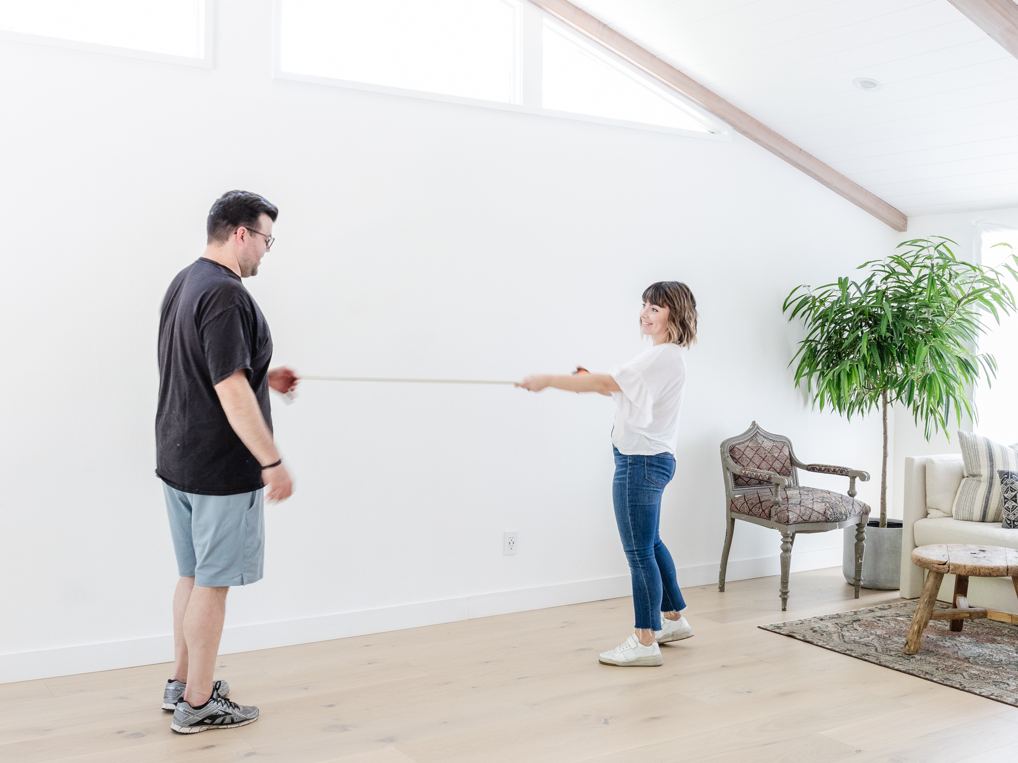
It’s been over a year since we finished Phase 1 of our Master Suite.
We knocked down a wall, lifted the foundation, paneled the ceiling, de-oranged the wood beams, finished the floor, and even built out a reading nook.
Whew. Looking back (and writing that all out), it was an ambitious project, but now we’re on the final stretch. For real this time.
Since then, it’s been living a second life as a multi-functional rec room. It’s our office space, our gym, and the kids’ play area when they’re wiling out the Wiggles. It even served as The Vintage Rug Shop’s unofficial headquarters/stock room for the six months leading up to the store opening.
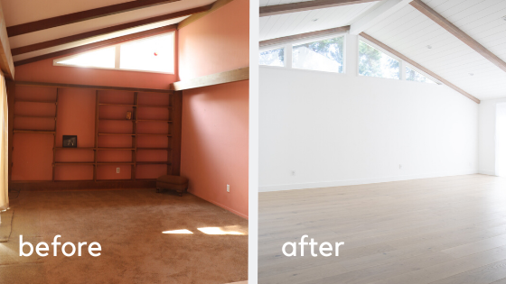
We plan to fully move into this room once the bathroom is finally complete, which (fingers crossed!) should be in the next couple of months. I got word last week that we’re officially next in line on our contractors schedule.
Now that the end is in sight, it’s finally time to draw up design boards. Aka my favorite part of any project. Pining and planning for this space has truly been a balm for my interiors-loving soul.
A clean palette
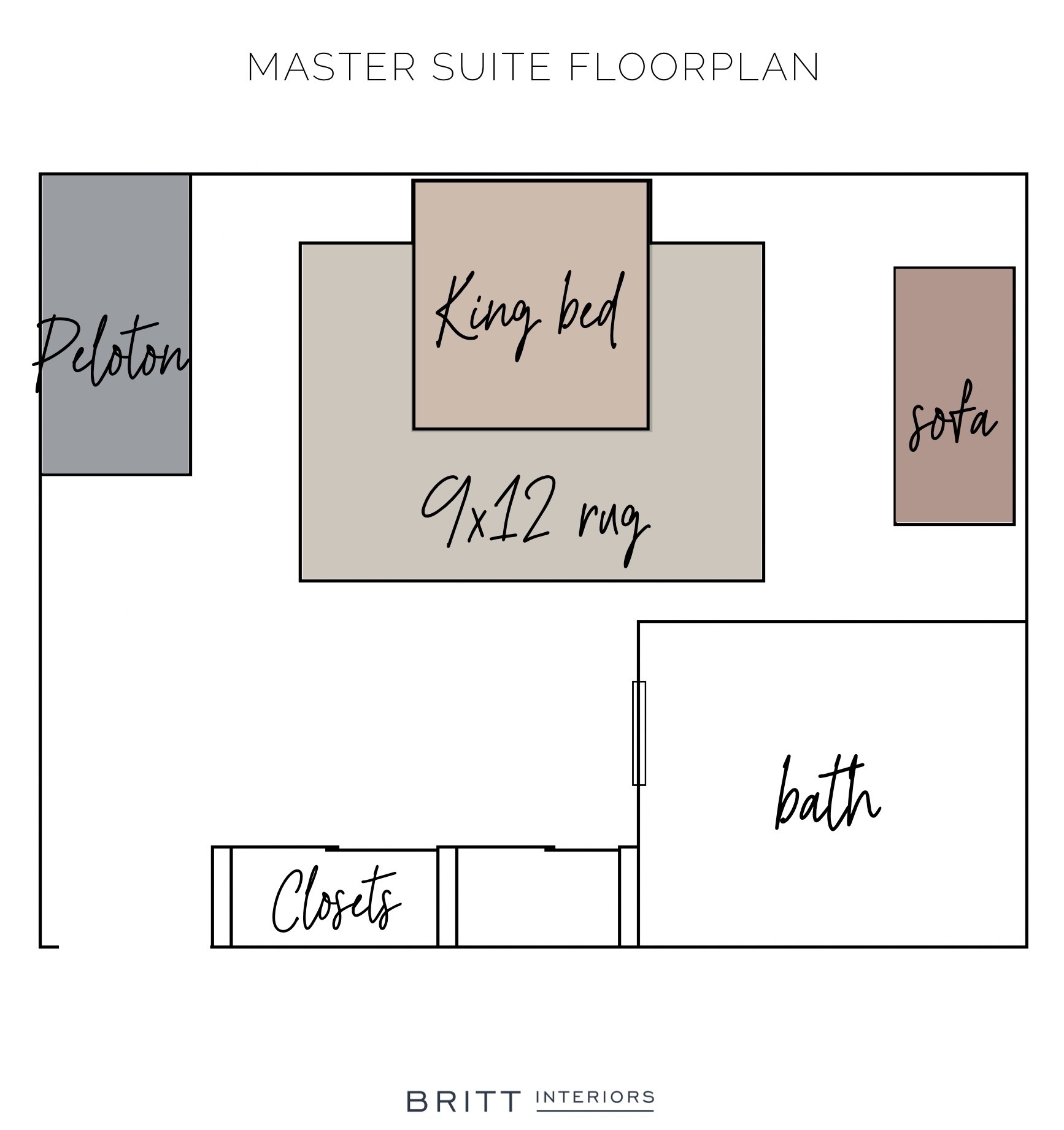
We plan to keep the reading nook as well as the Peloton in the room, which leaves only one natural spot for the bed—in the center in the room under the vaulted ceiling.
Three beds, three designs
Since we’re playing with such gorgeous high ceilings, my head goes straight to beds with a lot of WOW factor and that can take up some visual height. Specifically, canopy beds.
Who hasn’t daydreamed of owning a canopy bed? It’s got serious sleep swag, and I’ve always wondered if they sleep as great as they look. I don’t want to go too overboard on the whimsy as it’s just not my thing, and so I’m leaning towards a cleaner, more traditional silhouette.
So last night, after a Pinterest frenzy, I whipped up three different design directions based on the epic canopy beds I found and the rugs I have stashed away.
Design Direction # 1: Moody Sophisticate
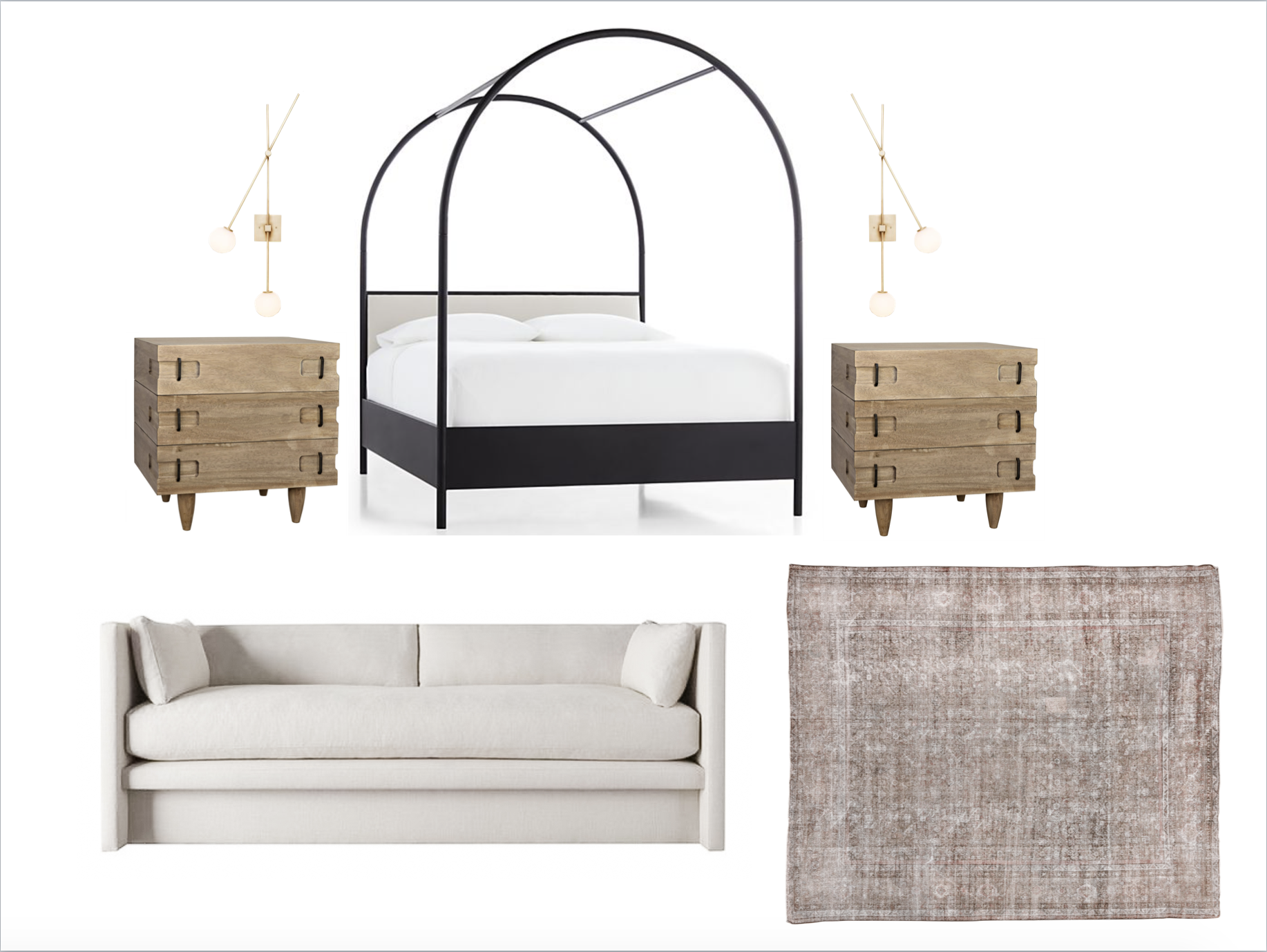 Bed // Nightstands // Sconces // Sofa // Rug
This bed!! I cannot with this bed. It certainly brings the drama, but it’s got this element of sophistication that I just can’t shake. The steel frame would play so well with the arc mirrors going up in our master bath.
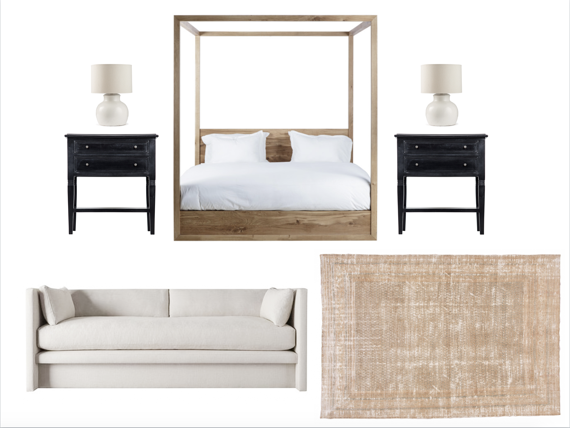
Design Direction #2: Eclectic California Staycation
Bed // Nightstands // Lamps // Sofa // Rug (similar)
Sometimes it’s tough for canopy beds to escape their association with tropical locales. Here, the white oak frame and clean modern lines are perfect for that laid-back California interior scene which I heart so much, without being too Swiss Family Robinson. I think it pairs well with the classic shape of these nightstands from The Vintage Rug Shop.
Design Direction #3: Chic Parisian hotel
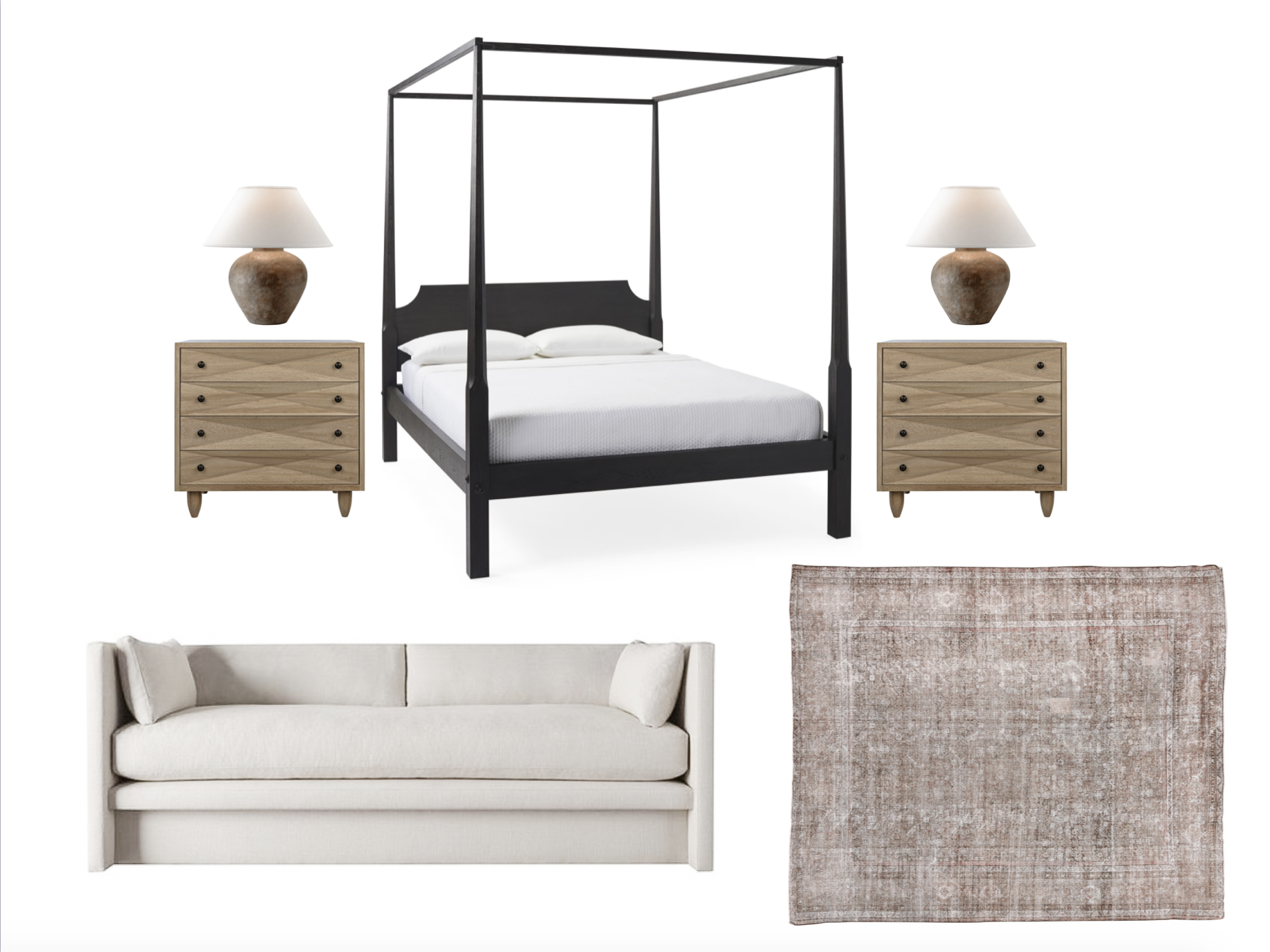
Bed // Lamps // Sofa // Rug
This one has me thinking of an old school cool hotel room somewhere in France. It’s hard to resist the classic silhouette of that sleek four poster bed. But are we playing it too safe with this option? It’s definitely the most tame of the bunch. Those nightstands are launching over on the Vintage Rug Shop soon, and the moment I laid eyes on them, I knew I wanted to find a way to work them into my own home.
What do you think?
If you had to pick, which bed would you choose? I’m leaning hard towards choice #1 but also feel the classic look of #3. It’s possible I’m entering into one of those zones where I’ve stared at my options for juuuuust a little too long.
)
)


I’d like a mix of 1 and 2. No1 good rug and lights and night stands but now sure how that bed will play with the filing angle so I like the bed from 2. The bed in 3 doesn’t feel like you
Forgot to say you could use a rug as a screen or hanging from ceiling to hide the peloton from the bed. That would bring in extra texture
Torn between 1 & 2!
I love # 2. Not too much, like an easy CA staycation!
The second one looks a lot like Chris Loves Julia’s master, so I would maybe skip that one! Love the first one with the Leann Ford bed!
I love the look of number 1 but prefer the nightstands of number 3. I don’t think any way you choose will be a bad way to go though. So much goodness here!
Do you mind sharing what arc mirrors you are using in your bathroom?? I am on the hunt for an arc mirror in my own bathroom too!
3
#1 hands down. Every component is a stunner.
Love 1!!!
I like the bed from #2, but I have a bed with a low board like that, and I am constantly banging my toes. It’s the one thing out of my bedroom that I wish I had done differently. Please save your toes! (I’m no lying…) I go with #3. It’s classic, but the cool contemporary lines on the nightstand are rockin’! (I love the lights from option 1 better).
#1! That bed is stunning! After I saw it I knew it would be my favorite without ever seeing the other options.
1! The low base on 2 is broken toe city. I’d say 3 also…if the headboard was square or arched…think the curved corners take something away.
#1…It would be stunning & different from the norm.
#2 is my favorite. I love the classic look
Number 3 with the lights from number 1!
I love them all, but #3 is my favorite.