
Hey folks! Before we dive in—thank you SO much for all the kindness and support on this project! It was definitely a beast, and the positive response fills me up!
So today we’re back again today with Part 2 of the #ManilaVilla project. If you haven’t seen Part 1, head over to this post now. Go on, I’ll wait. (It’s worth it, I swear!)
Today we’re going to do a reveal of the two upstairs units. Buckle up, because it’s a big one—two bedrooms, one dining space, and two living rooms. While we were working on these two units, we referred to these as “A-Side” and “B-side,” kinda like the two different lineups on a vinyl record. And though the reference feels a bit dated, the name stuck.
Similar to the downstairs unit, this was one big blank slate with some seriously kicking architectural details.
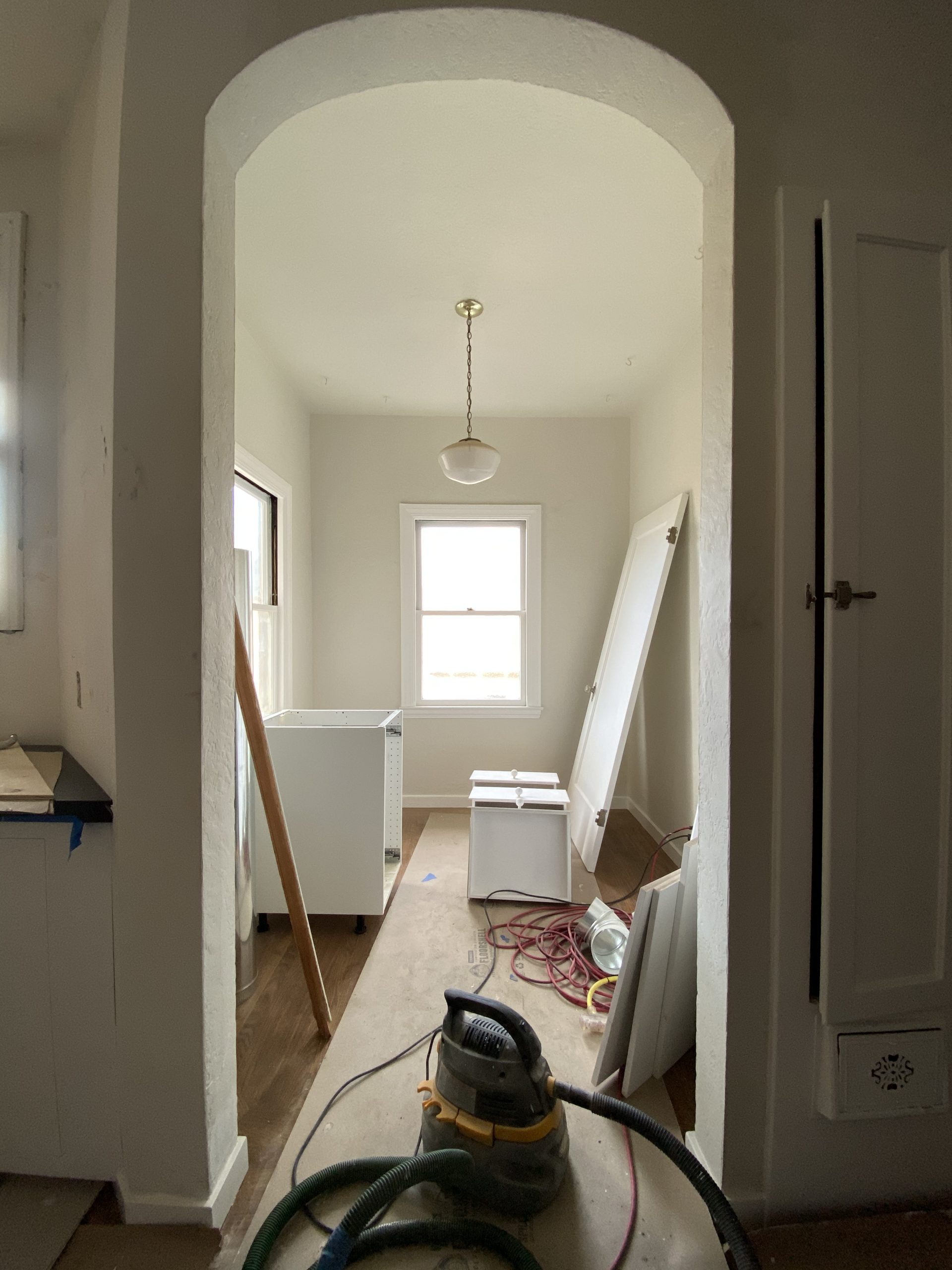
We love a good before and after around here, so without further ado, let’s dive into the after!
The Living Room (A-Side)
It would be easier—but far less fun—if all living rooms were a square shape. This particular room has lots of angled walls to work with and gets beautiful light from two sides. I’ve been dying to use this gorgeous green leather sofa in a project, and this was its shining moment.

Sofa // Nesting Side Table // Coffee Table // Chair // Art // Basket
It pairs beautifully with this rug, which has a color story that feels complementary to that delicious shade of green.
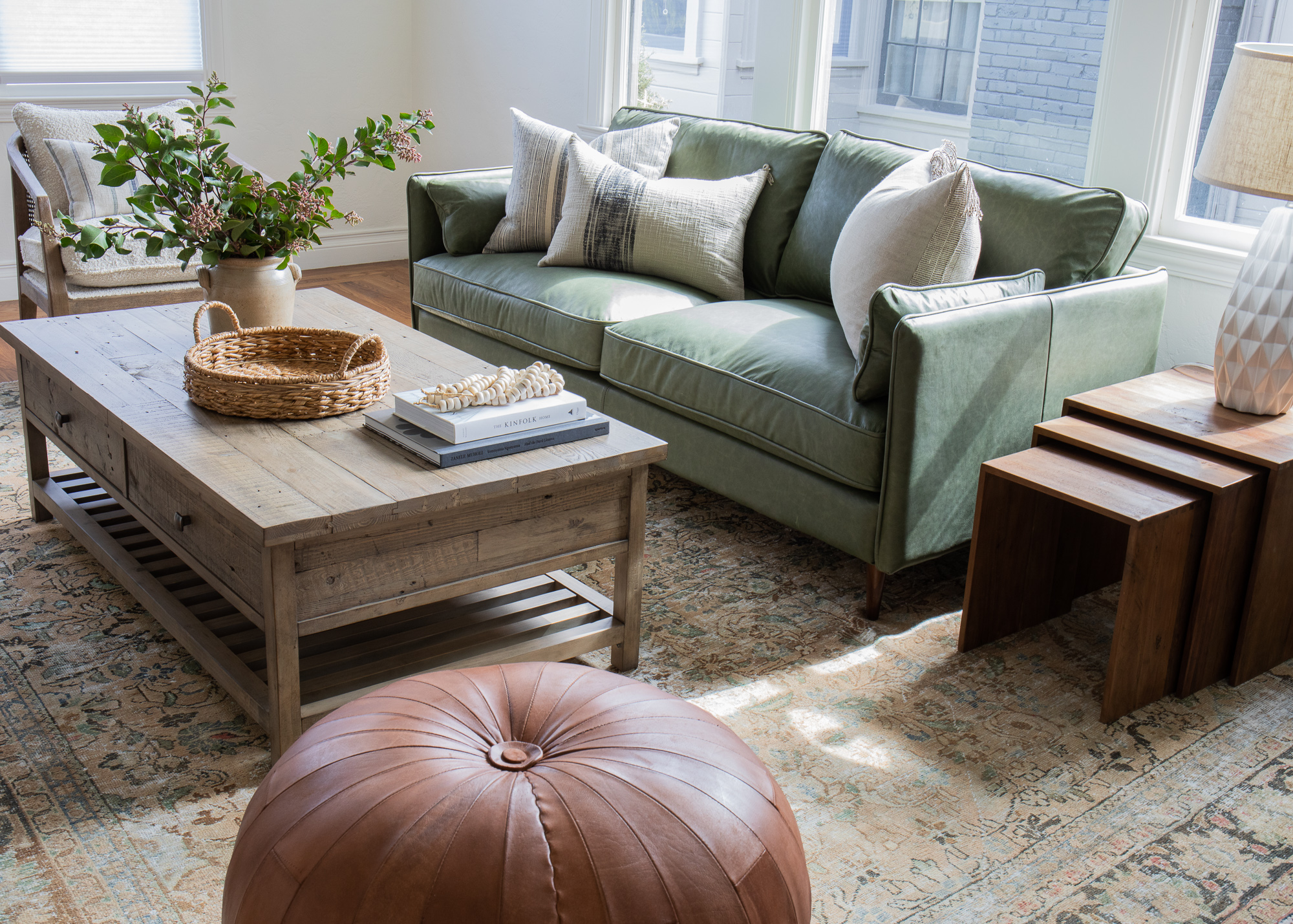 Rug // Basket // Book // Beads // Pillows // Jug (Vintage) // Lamp
Overall, we were going for an open, inviting, earthy feel in here and I daresay we pulled it off?
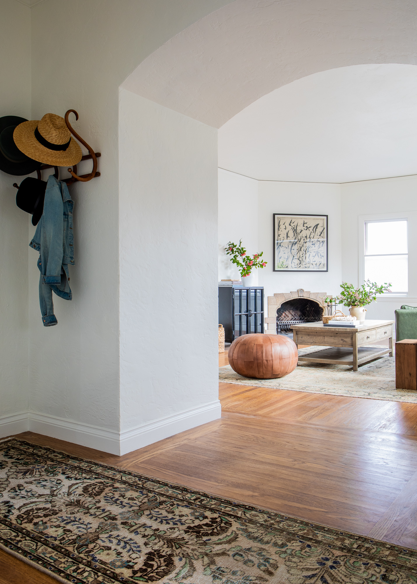
Master Bedroom (A-Side)
For the bedroom in this unit, we were dealing with another angled wall situation, so I decided to center the bed on the two main windows in the room. That way, when you open the bedroom door instead of walking right into the side of the bed you’re greeted by this soothing bedscape.
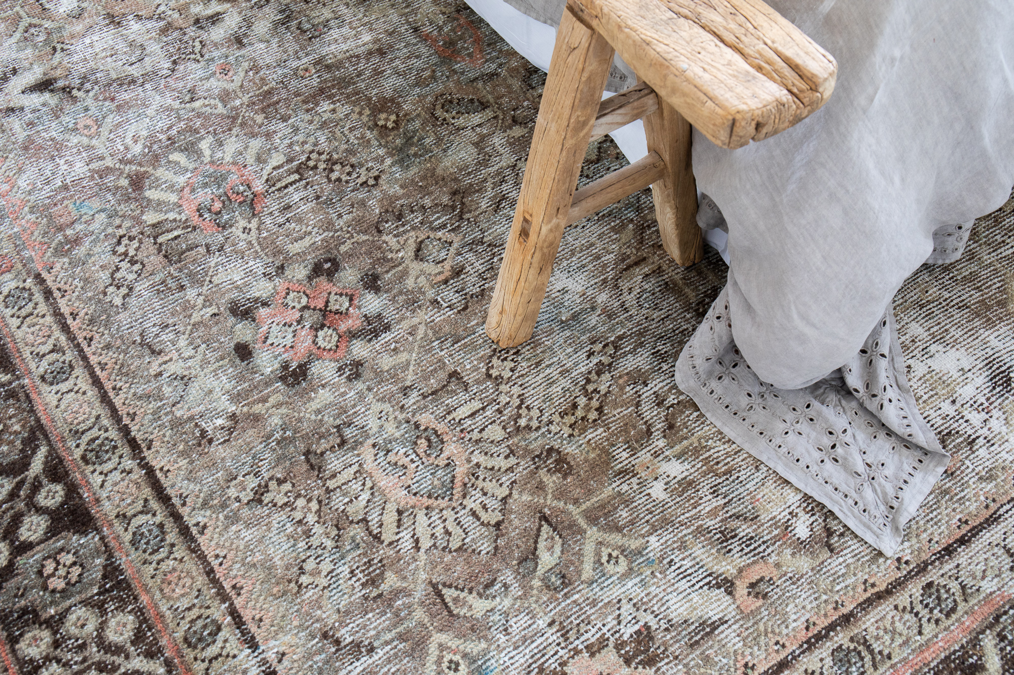
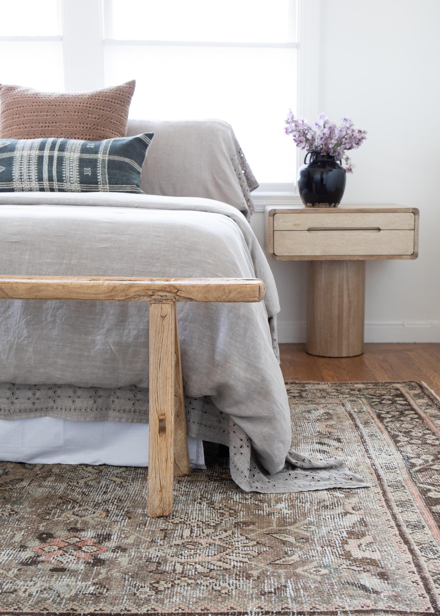 Rug (similar) // Nightstand // Waffle Pillow // Blue Pillow (similar) // Jar // Bench (vintage)
We kept decor minimal and muted in here, adding in a few interesting pieces like our linen duvet with eyelet detailing and that shapely nightstand. It brings a subtly playful punch in here, don’t you think?
Pinterest may lead you to the belief ‘the more pillows, the better,’ but in this case, we created a peaceful moment with just two. That muddy berry one I found at Target! Its texture and wash is so good. It also has a zipper so you can remove the standard poly insert and replace with down to take it to the next level.
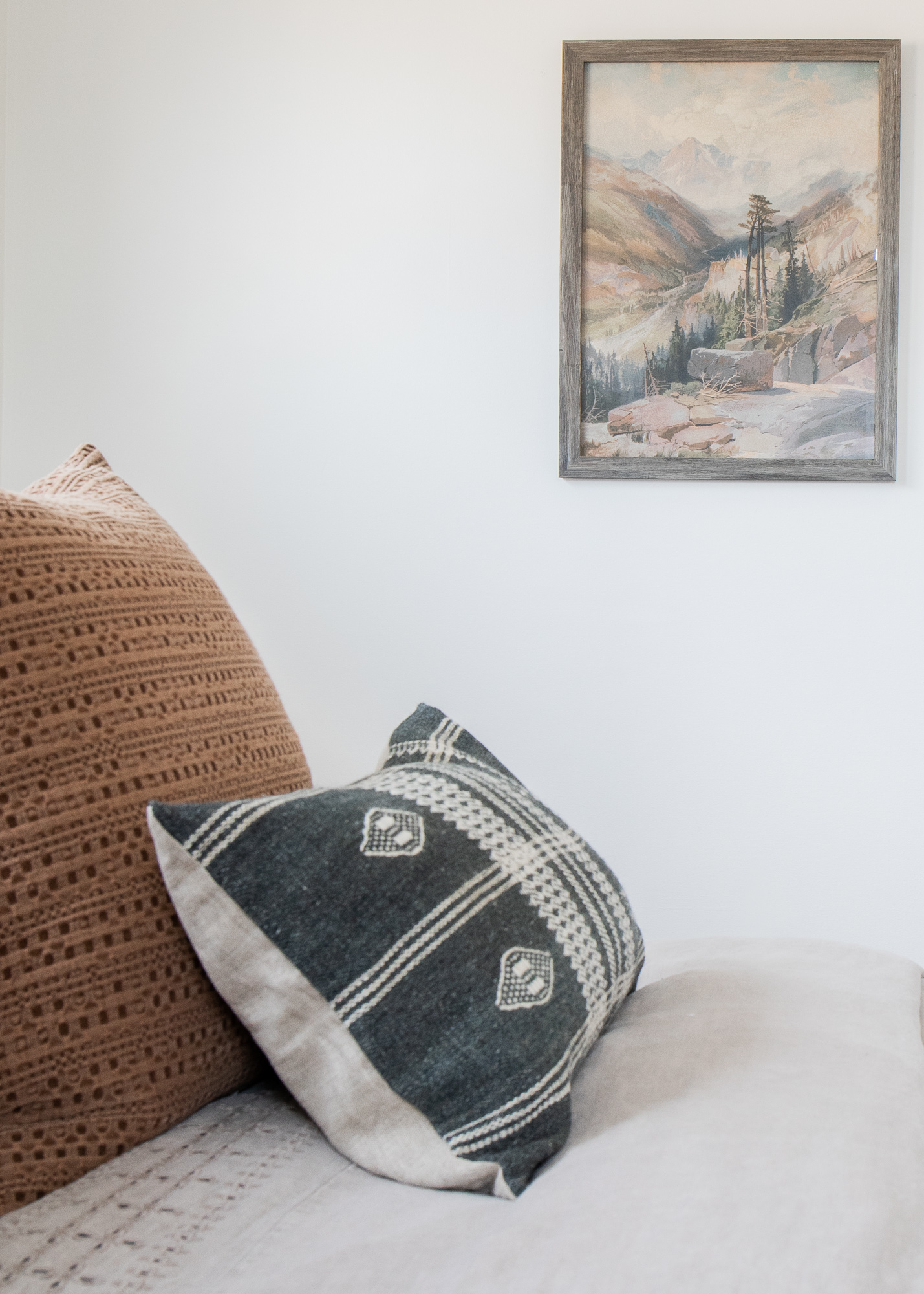
Art // Eyelet Duvet (coming soon to the shop!)
Bedroom (B-Side)
Moving into the second upstairs unit, we have this lush master bedroom.
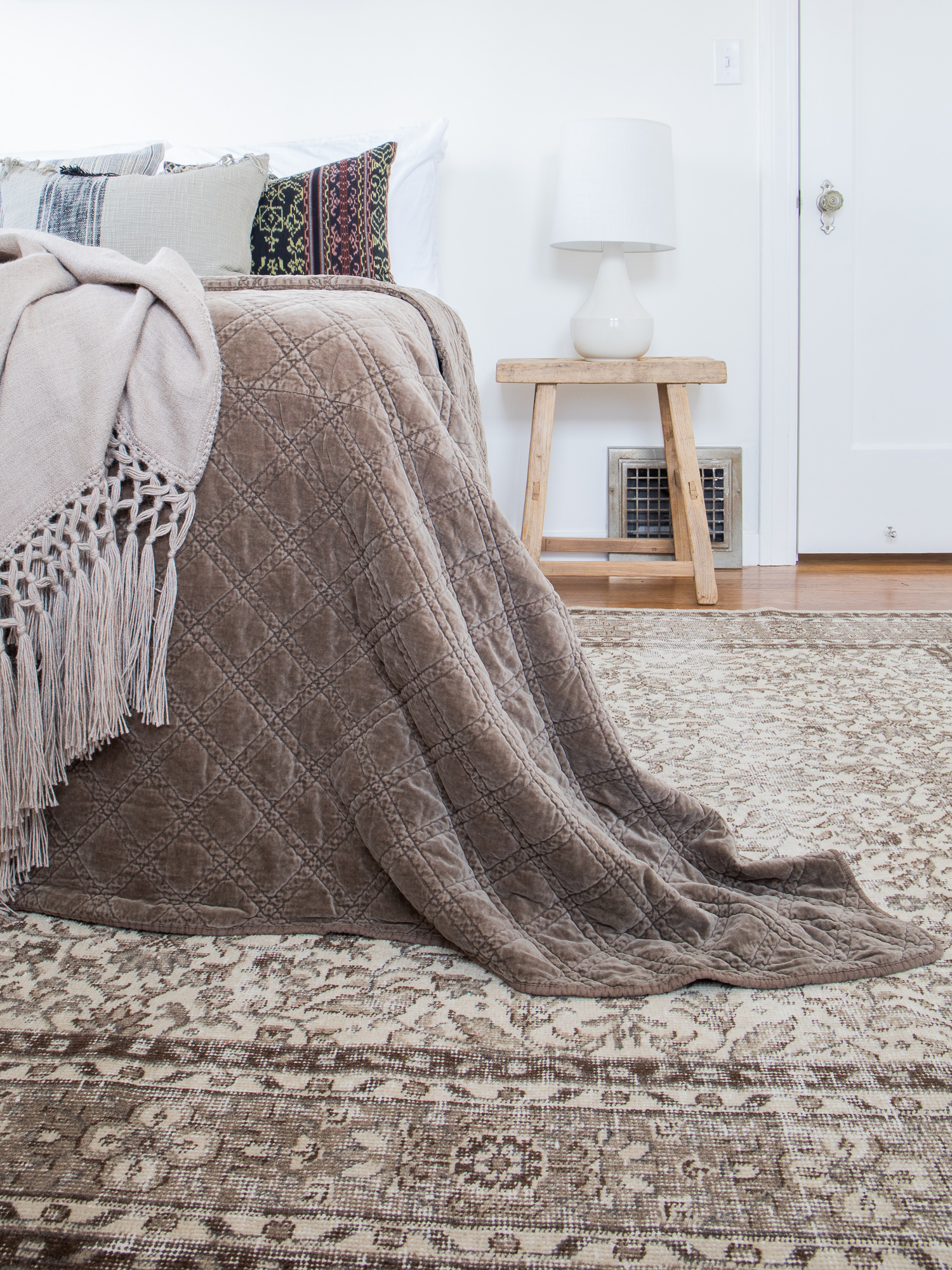 Rug (similar) // Nightstand // Pillows // Throw // Lamp
I started with the rug and the rest came together fairly easily. I left this space unfussy, letting the textures speak for themselves. That beige-y vintage rug with an all-over floral pattern paired with crushed velvet coverlet (also coming soon to the shop!) create a truly luxe nighttime scene. Tonal done right if you ask me!
Dining Room (B-Side)
This dining nook is the definition of bright, clean, and airy. It connects right to the kitchen. I wanted to elevate the white tones with lots of visual texture without weighing down the boxier profile of the room. These plush sherpa and oak dining chairs were just the thing.
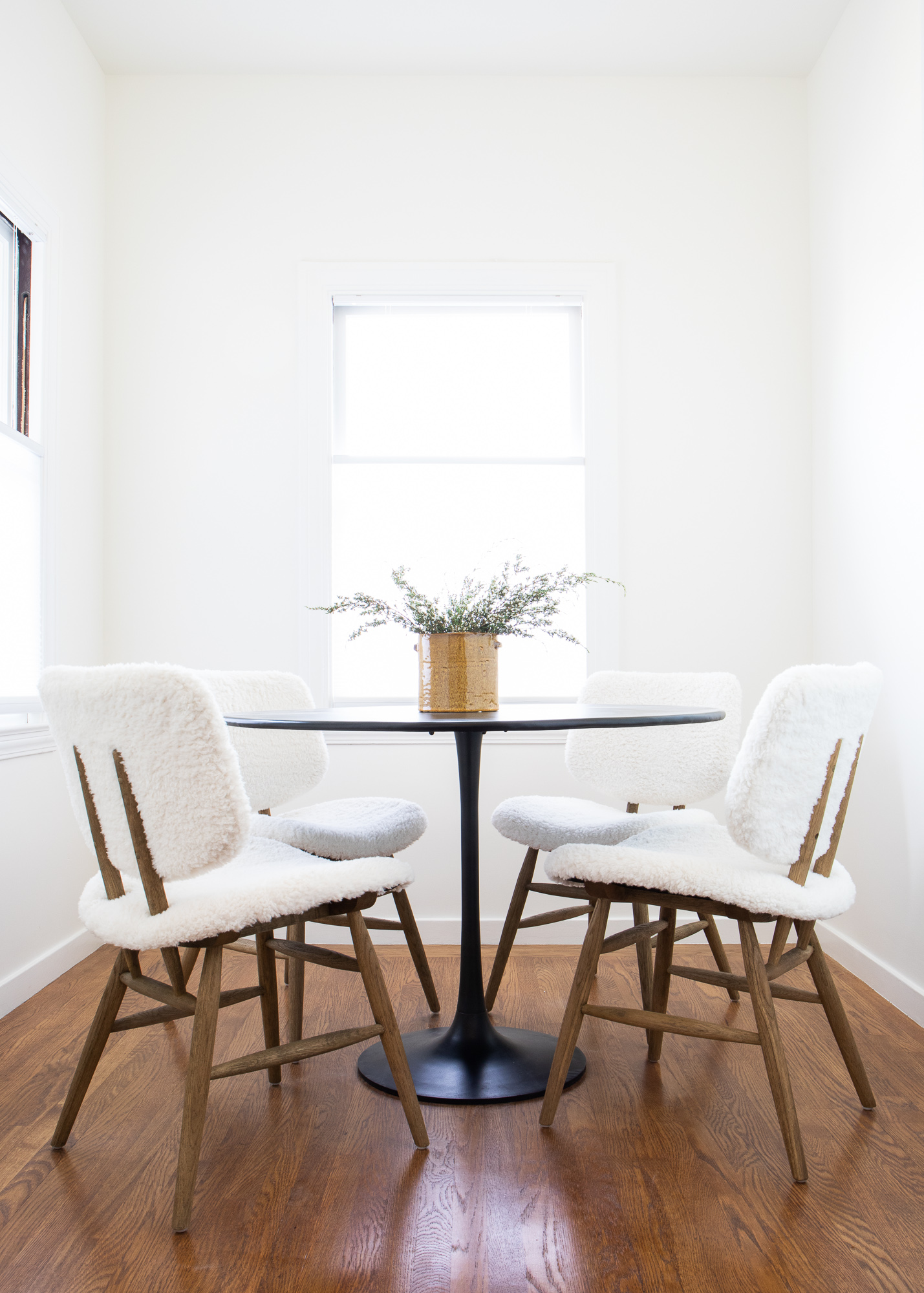
Dining Chairs // Pot
Living Room (B-Side)
And the last stop on the reveal is this gorgeously spacious living room!
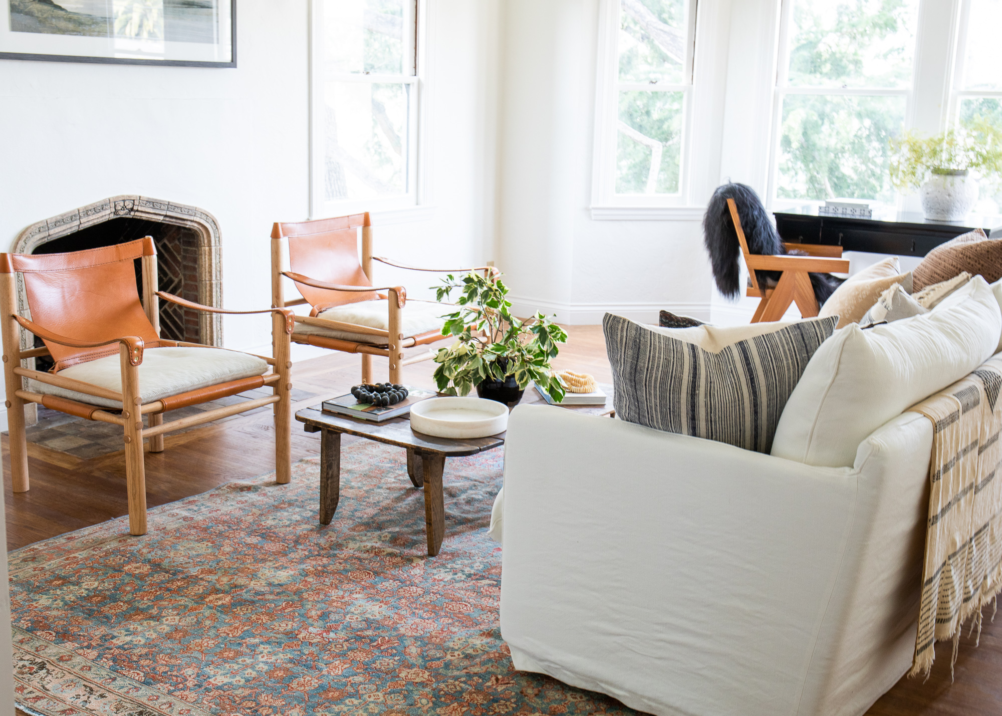 Art // Sofa // Rug // Marble Tray (similar) // Accent Chairs (call the shop for availability) // Desk // Desk Chair
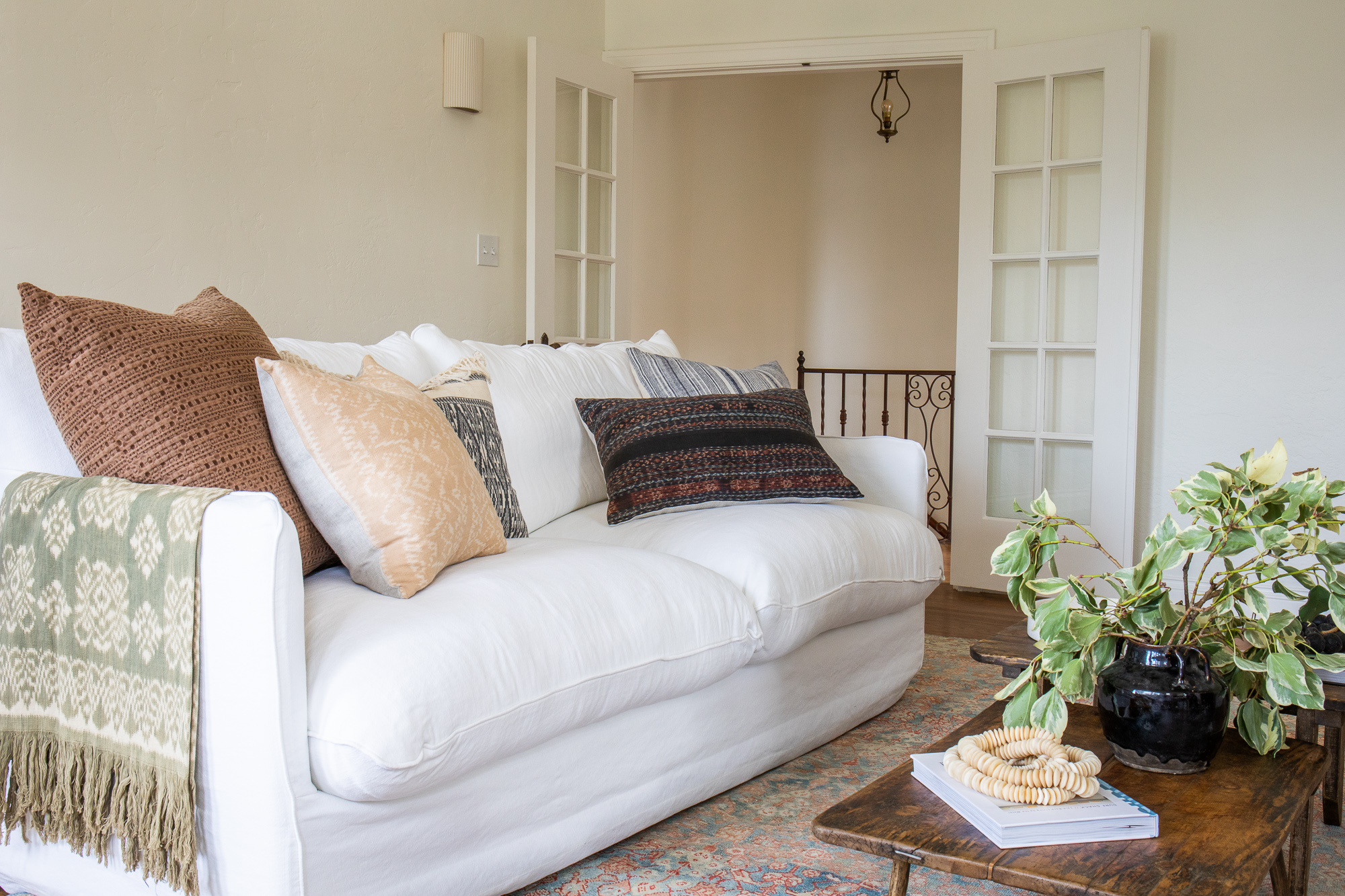
I wanted to create a space that felt collected but also light and comfortable. I centered everything on that insanely comfortable white cloud of a couch. Its slipcover upholstery is casual and inviting, and the overstuffed cushions are deep and irresistibly comfortable.
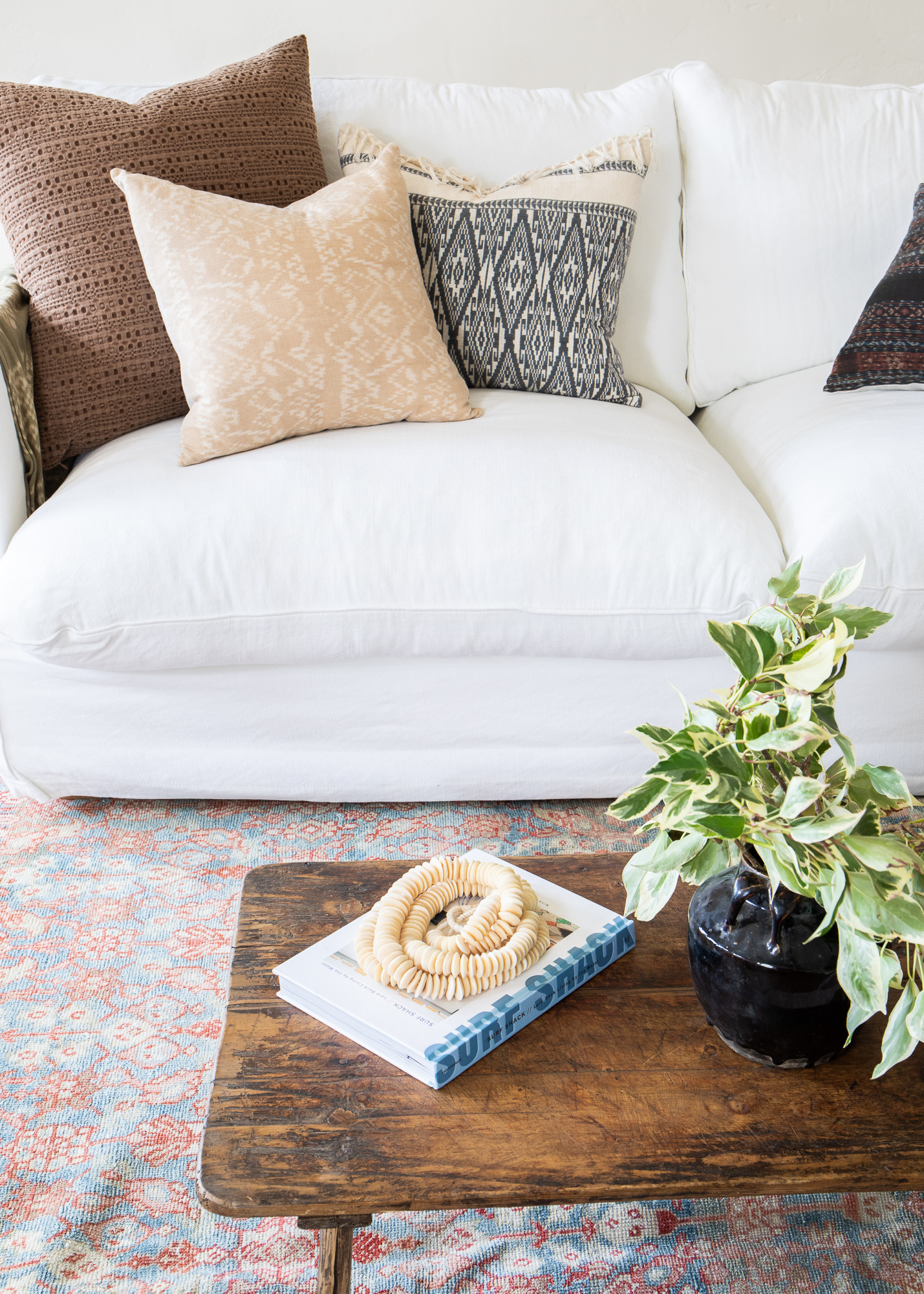
Book (similar) // Beads // Waffle Pillow // Pillows // Jar
Our vintage Rellie rug is playful yet muted. The colors in this rug are a bit more vibrant than what we’ve used throughout the rest of the project, but it works because it feels sun-kissed. Mixing in collected textiles made this living space feel more lived-in and intentional.
The living room in B-Side is long and wide, so utilizing the space appropriately was key. Instead of tucking all of the furniture against the wall, I created a separate walking space behind the couch with room for a table or wall moment. If we tucked the furniture against the wall all the pieces in the space would feel dwarfed within the grandness of the space. I created space for two more zones. To the right of the French doors, there’s room for a home library or reading nook. Over by the window I carved out space for a home office.
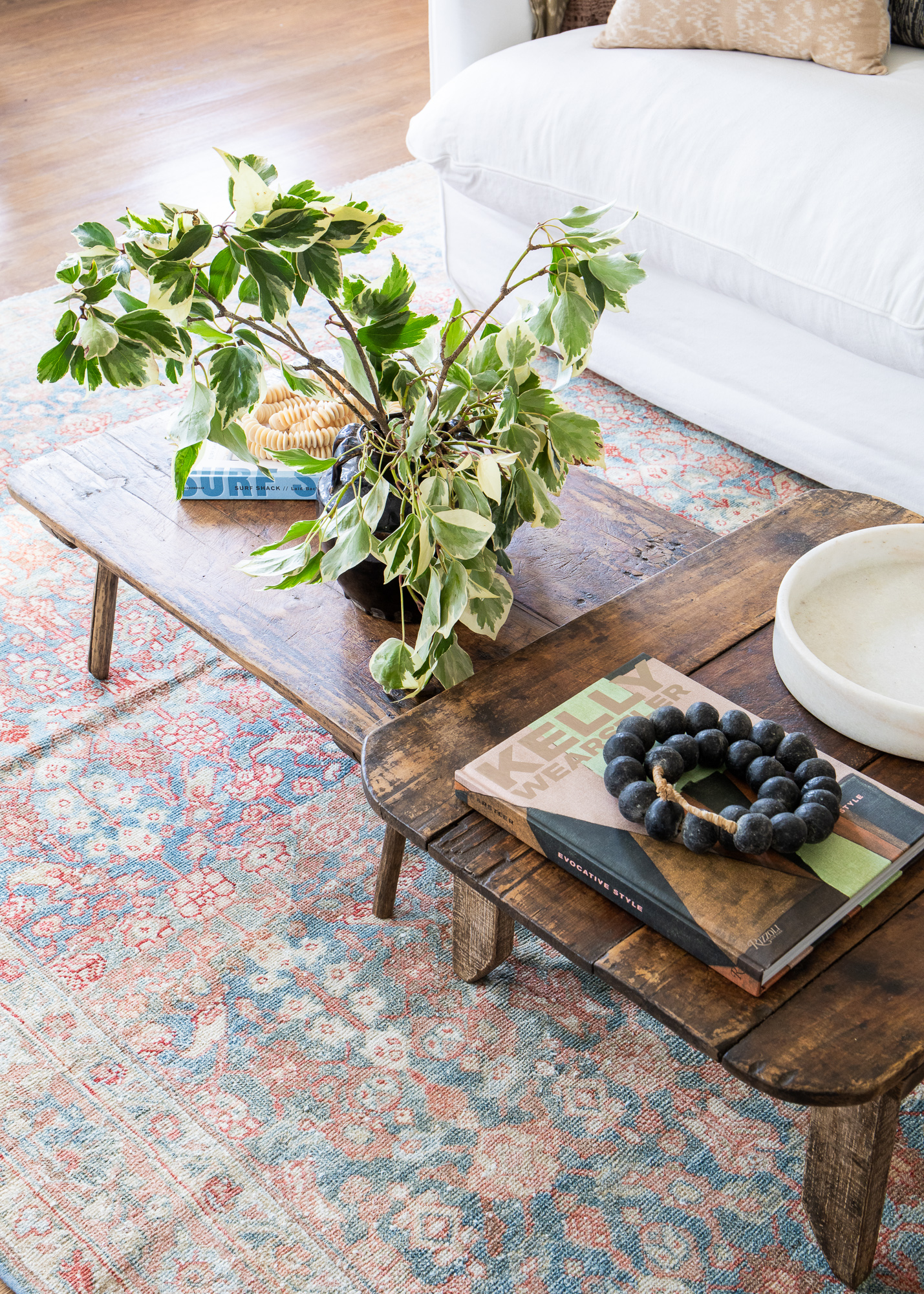
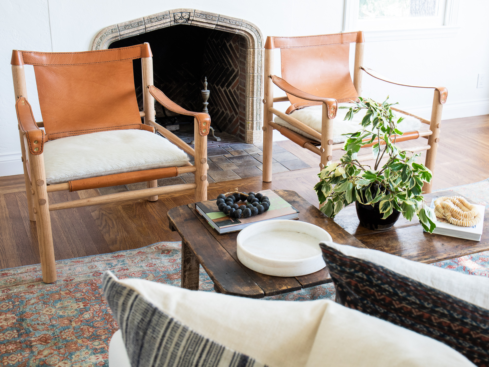
I used to get so caught up in sourcing the perfect coffee fable. I never could find exactly what I was looking for in new pieces. Call me a coffee table snob but a vintage coffee table is always the right move. I went with my favorite coffee table trick here by stacking two vintage pieces together. They tuck together when needed but also create some really interesting depth and texture for the room.
I originally sourced those saddle chairs for my own master suite, and they remain a personal favorite. I’ve used them in a couple of projects since and the leather sling look works so well here.
Whew! Well, that just about wraps up the entirety of our Manila Project Reveal.
I went ahead and linked individual sources underneath each photo, but also wanted to mention that we’ve created a special collection online so you can easily browse everything from this project in one place.
From the bottom of my heart, I hope each of you is staying safe and sound during this time. And I hope this reveal brought a little moment of lightness to your day!
)
)


Gorgeous! Do you have a source for the eyelet trimmed duvet? Thank you!
I love everything about this project! It is providing me endless inspiration! Your styling and design choices are spot on.