Readers: In light of the current health crisis, we offer this post as a respite from the stress & anxiety you may be experiencing. Everyone is impacted by COVID-19, and as we manage our own hardships we’ve found mental breaks in the form of beautifully designed interiors gives us a sense of normalcy and peace. We are committed to keeping this space one of positivity and inspiration and will be serving up content that aligns to that mission. If this isn’t right for you at this time, we understand.
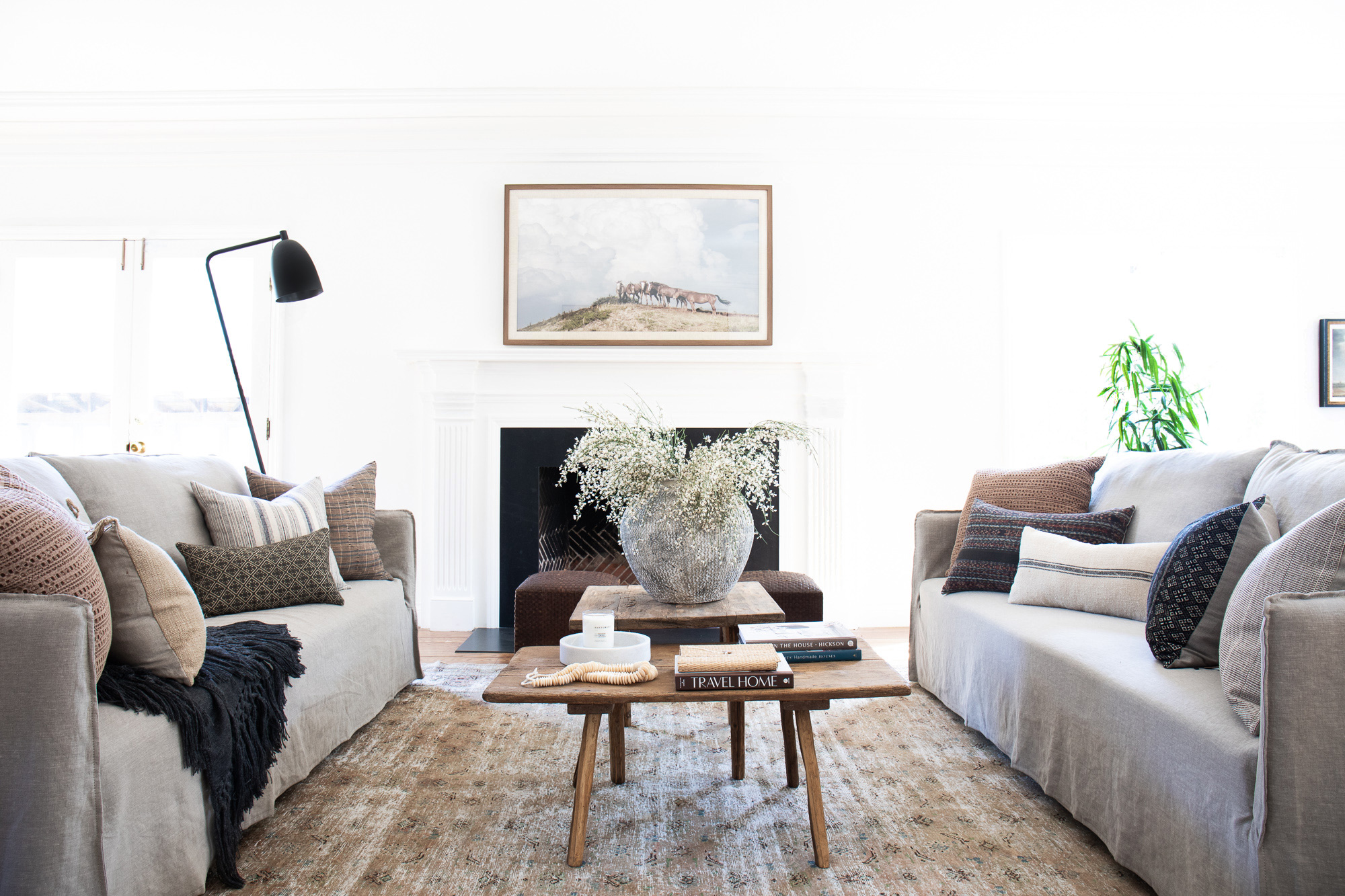
The origin story of this fun project is as unique as the project itself. So be prepared! This a long post!
A couple of months after I opened The Vintage Rug Shop, a customer strolled into the storefront. We got to chatting and I learned he’s an Oakland-based residential developer. He was thrilled to stumble across our shop and he kept raving about the aesthetic. I’ve said this before—connecting with the local community in person (and meeting so many Instagram friends IRL!) has been the highlight of opening the Vintage Rug Shop, but I was definitely blushing by the end of our conversation.
A few weeks later, he returned. And brought with him a proposition: he was working on a big condo conversion project and wanted to work with me on staging it for sale. He said (and I quote), “I want the residences to look exactly like your store!” At that point, I was only a few months into opening the storefront and had my hands full. I kind of brushed the offer off and went about my day.
But the next time he stopped in, he brought his business partner and his husband. I was blissfully unaware of the fact that it was to get their thumbs up on securing my bid.
And then he stopped into the store one final time. I was working in the back of the shop and I hear his distinctive voice, “Is Brittany here?” I walked out to greet him and immediately he says, “Hey, so, the site is only a five minute drive from here. Do you want to hop in my car and check it out?”
And, throwing reason out the window, I did.
(And yes, my husband wasn’t exactly thrilled when I told him the story later that night of how I got into a car with a man I barely knew haha.)
I believe he was confident that once I saw the architecture of the space I wouldn’t be able to resist staging his project.
He was right.
The Manila Villa was a sight to behold, even with buckets of drywall and paint cluttering the entryway. It’s a three building residential property originally built in the early 1900’s, with a gorgeous sunlit courtyard in the middle. Arched entryways, bay windows, crown moulding—trust me when I say this property has it alllll.
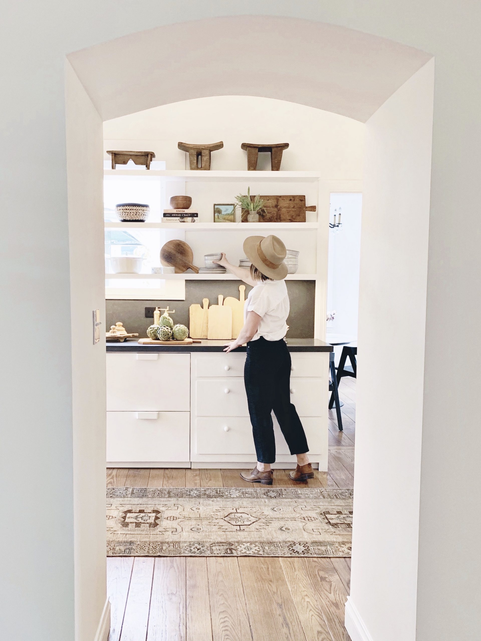
Less than a month later, I found myself presenting mood boards for the first three unit building, which they were using as the showpiece property for the sale. I was all in, folks. Any initial thoughts I had about “taking on too much” had evaporated, replaced with rich textiles, new art, and a hunter green leather sofa that I knew would be just perfect for one of the upstairs living rooms.
One of the big reasons I was stoked about this project was that I was given free creative reign to do whatever I wanted (design wise) with the space, as long as I kept it “looking like my store.” Having that kind of freedom is pretty rare with client work. In a typical client project, the designer is usually balancing the practical needs of the family as well as the tastes of multiple people, and it can be a lot to manage.
My client hired us to stage all three residential units for sale. He emphasized that he wanted the spaces to feel and look radically different than what you often see in staging environments. Generally, home staging projects utilize a much more pulled-back style and tend to be more formulaic. Realtors want to create a neutral environment that makes it easy for any buyer to imagine themselves living in the home and that can appeal to a wide swath of tastes. I usually design with a LOT of layers and personality, and that was the level of design my client wanted to bring into his freshly renovated building.
My client also wanted to give the future homebuyers the opportunity to purchase the furniture pieces to be a true “move-in ready” unit. It appeals to many buyers in our area as these residences are a hop-skip away from the heart of Silicon Valley. My client’s ask was to make each unit feel lived-in. Using the charm of the early 1900’s architecture as my inspiration, I went with an elegant but earthy color palette and a warm, collected style—my favorite vibe!
I’m so pumped to reveal this project! Ever since opening the shop our team has been feverishly working on launching our furniture collection to our online audience. This project was the perfect opportunity to showcase our favorite pieces in the spectacular setting they deserve. This was another big motivator for taking on this staging project—even though I knew it was going to be a challenge juggling all of the moving parts, it would all be worth it!
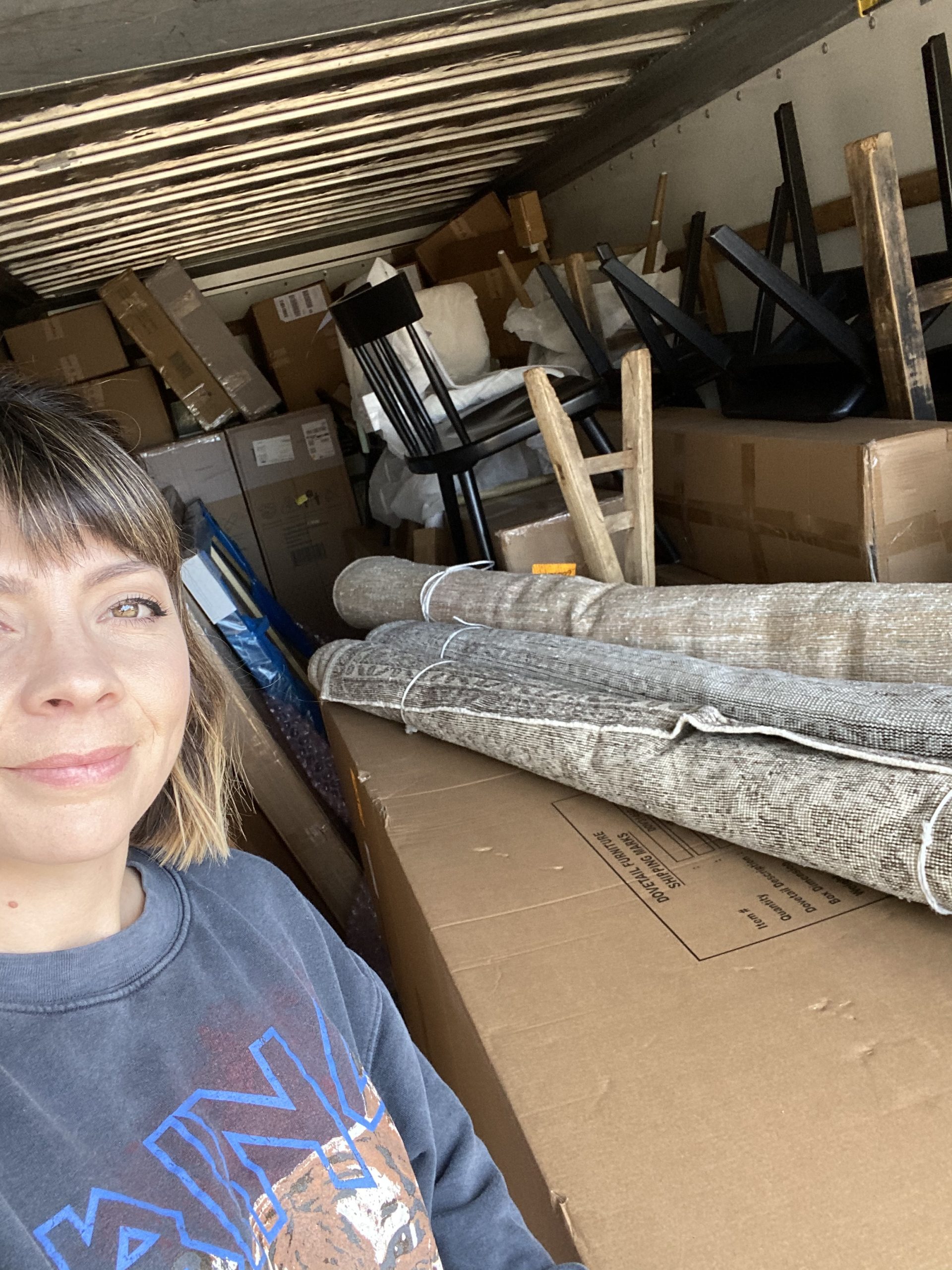
Many of you already saw the emotional behind-scenes in my stories, but I’ll be honest here: this project brought me to my edge. I’m one of those folks that tends to learn by doing, and this was definitely a learning experience for me on so many levels—as a designer and as a business owner. Maybe I’ll open up more in the coming weeks on the hard lessons I learned. By the end of the install I was definitely referring to this project as the “Manila Killa” in my head. ‘Killa’ because I had full faith that it was going to turn out, well, KILLER, but also had a feeling that it might take me out in the process.
From a design perspective, it was radically different from interiors clients that I’ve taken on in the past. Three different units under one roof meant we were working with three different kitchens, three living spaces, and multiple bedrooms, all within a very short timeline. I only had five weeks to order all the furniture and install the project. I wanted to create a cohesive flow between each of the units, but also ensure that could standalone as distinct design stories. So, yeah. No easy feat.
Now onto the reveal! First up is the largest of the three units and includes a kitchen, a living room, and two bedrooms. Over 2200 square feet of juicy “after,” finally coming at ya!
THE MAIN LIVING ROOM
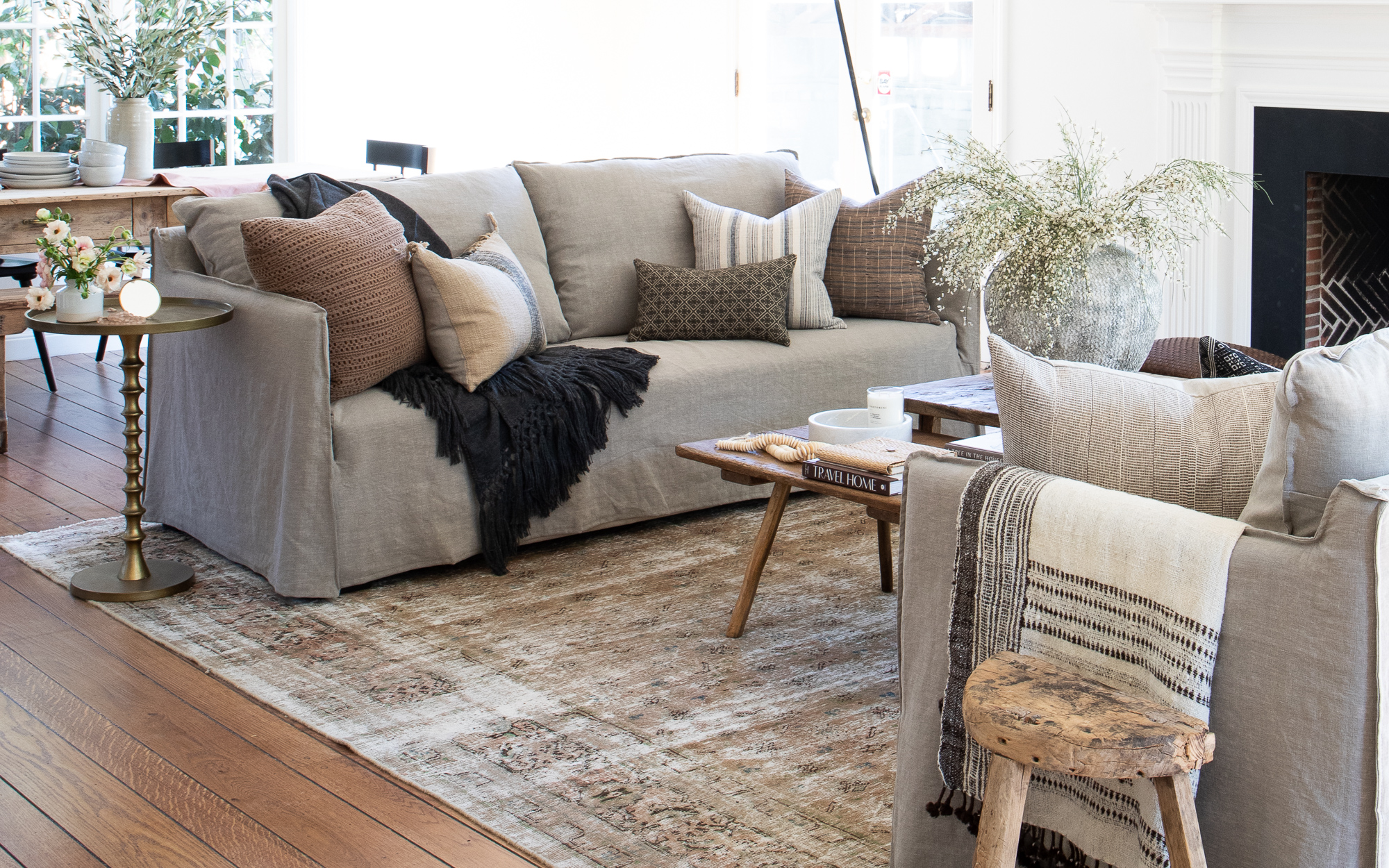
Side Table// Rug (Similar) // Sofa // Pillows // Waffle pillow
Nine times out of ten, when designing a space, I start by selecting the rug. It helps me figure out the right color palette and is ultimately the best jumping off point for the overall style. Buuuut I totally broke my own rule here and started with the seating. We briefly considered a sectional, but it would have closed off the view from the entry way as well as to the backyard, and forced us into some strange furniture configurations. Ultimately we landed on these beautiful stone linen sofas facing one another to create an open conversation area. I pulled that neutral color story through the rest of the room with the rug and a tonal pillow set. That dusty rose pillow is one of my forever-faves, sourced from the one and only Target!
From there, everything else flowed. Since it was such a long and grand room, I broke it up into a few different zones: a landing zone, a private reading nook, the sitting area, and a more formal dining space.
Styling a large-scale art piece in a prominent location is the designer way of saying, “Hey future homebuyer, a TV could totally go here.” That’s what I did here with the space over the mantel, although I know that placing a television set over a fireplace is considered ~controversial~ in some circles.

Art // Pillows // Poufs (similar)
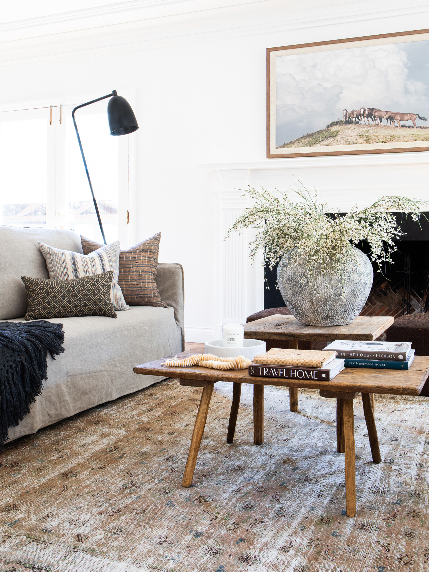
Lamp // Fringe blanket // Beads // Candle // Pot // Books
The first thing you see when coming in from the front door is this sweet little reading vignette.
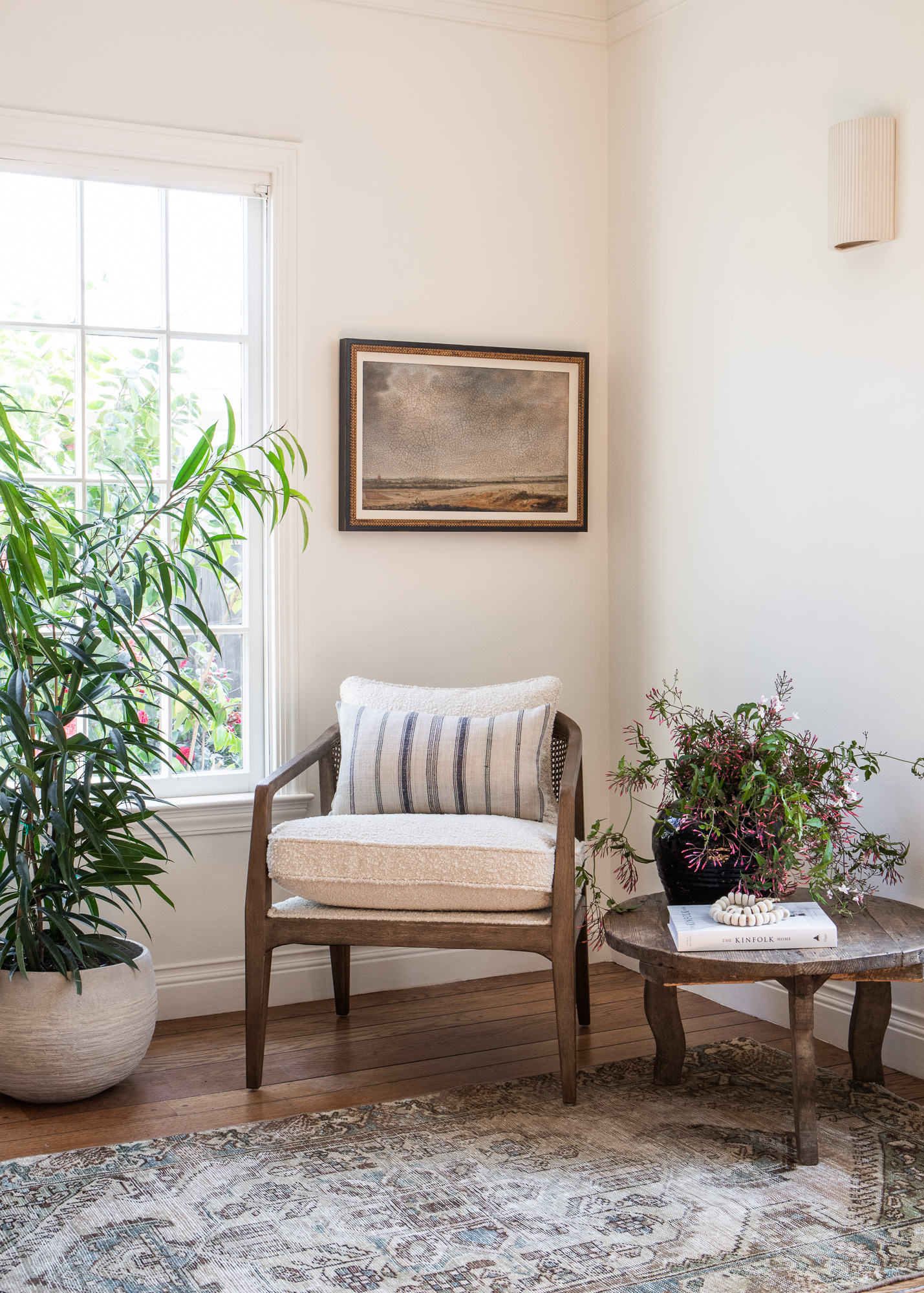
Rug // Chair // Pillow (similar) // Table (vintage) // Sconce // Book // Beads // Pot // Art
On the opposite wall is a landing zone that balances out the seating area of the living room. I imagine the future owners could use it as a secondary drop point after the more formal entryway.
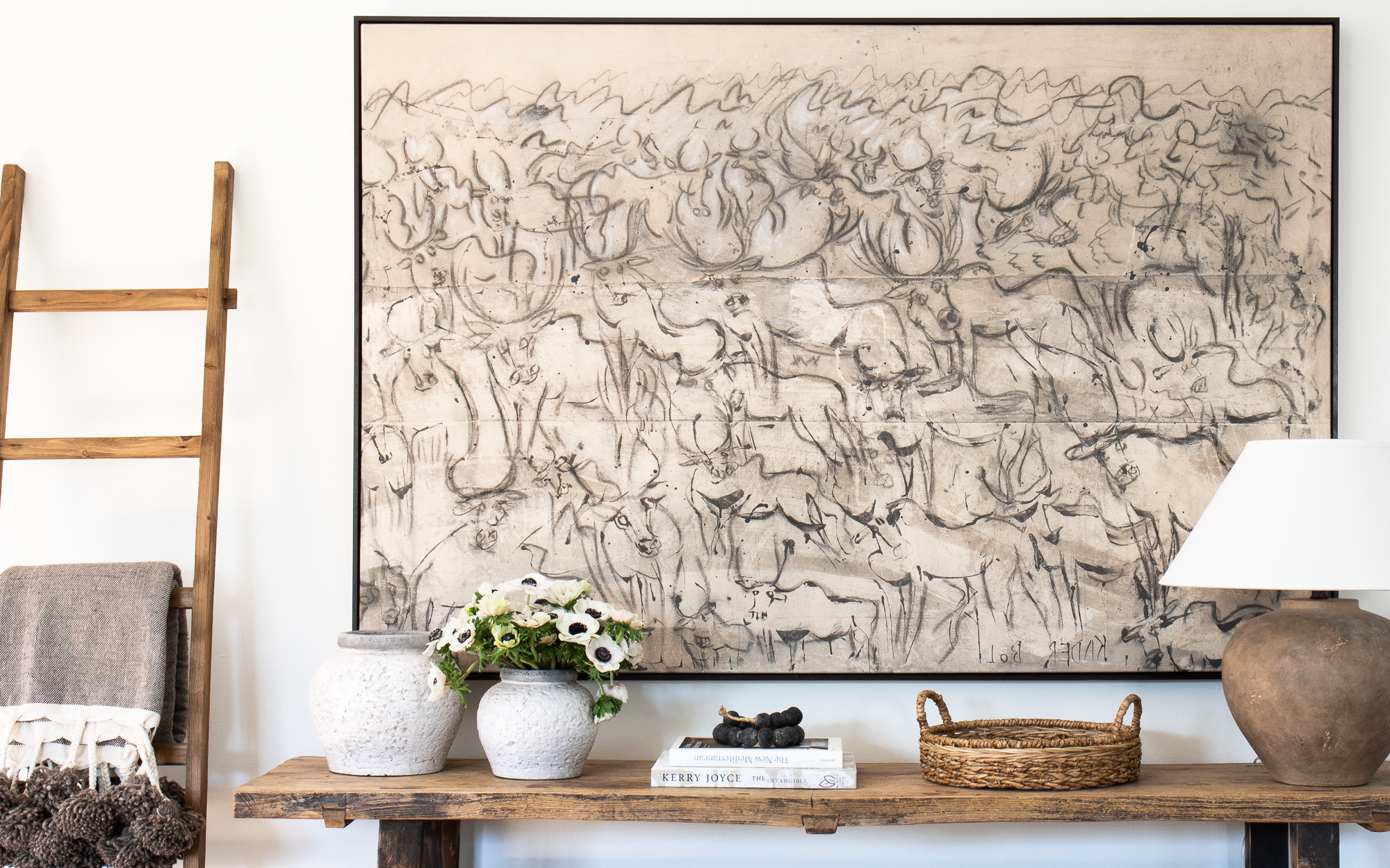
Pom Pom Blanket // Lamp
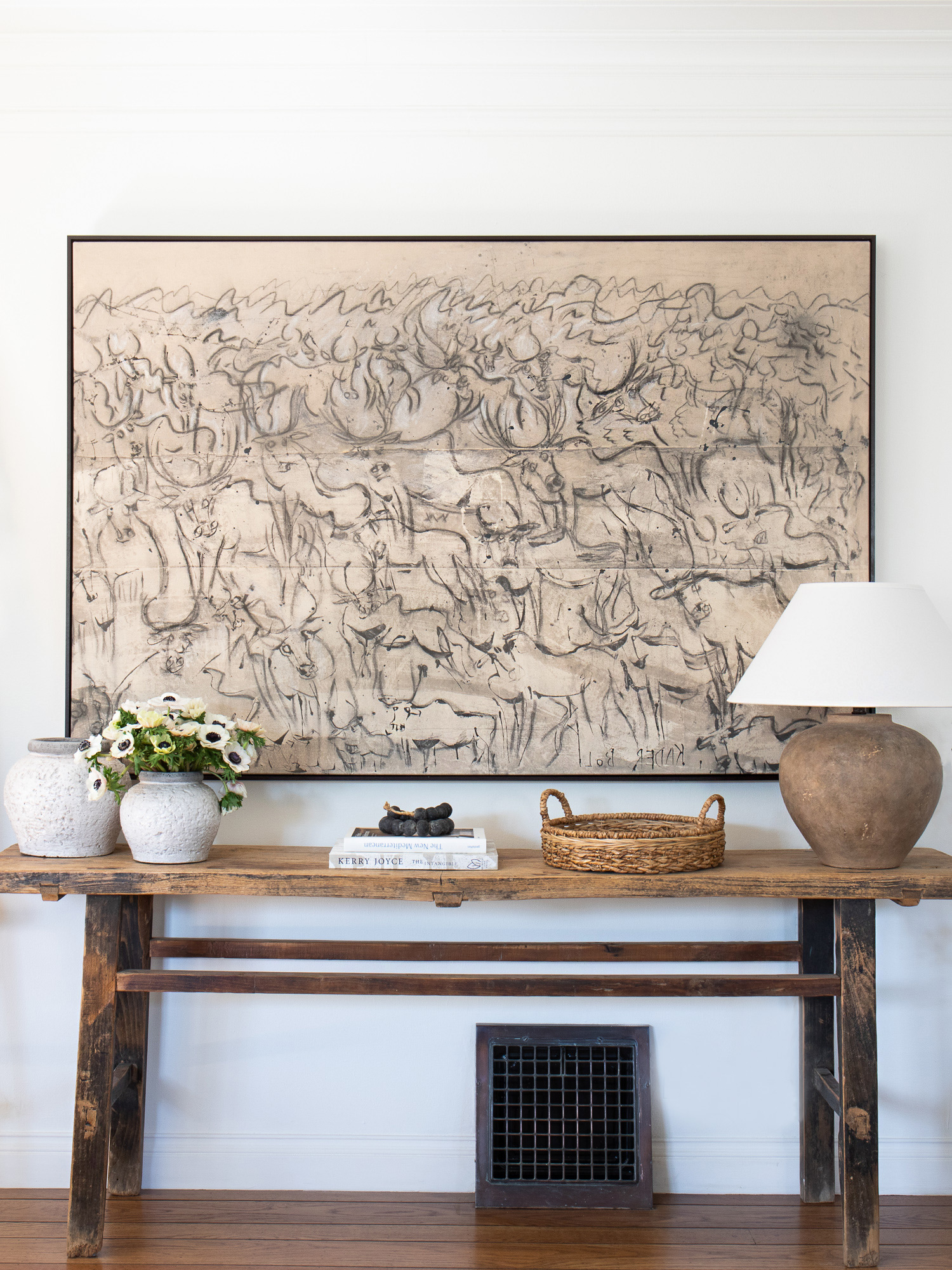
Art // Console Table (vintage)
This was another wall that was just begging for a large art piece, and Kader Boly’s Migration is one of those rare finds that makes a statement but can integrate well with almost any style. This area faces the two sofas, so it could easily be adapted as a media center if you’re firmly in the no-TV-over-the-fireplace camp.
Functionally, we needed a table that had height so it could clear that sweet little 1900’s vent, but that was narrow enough to allow for good flow into the room. This vintage reclaimed wood console did just the trick.
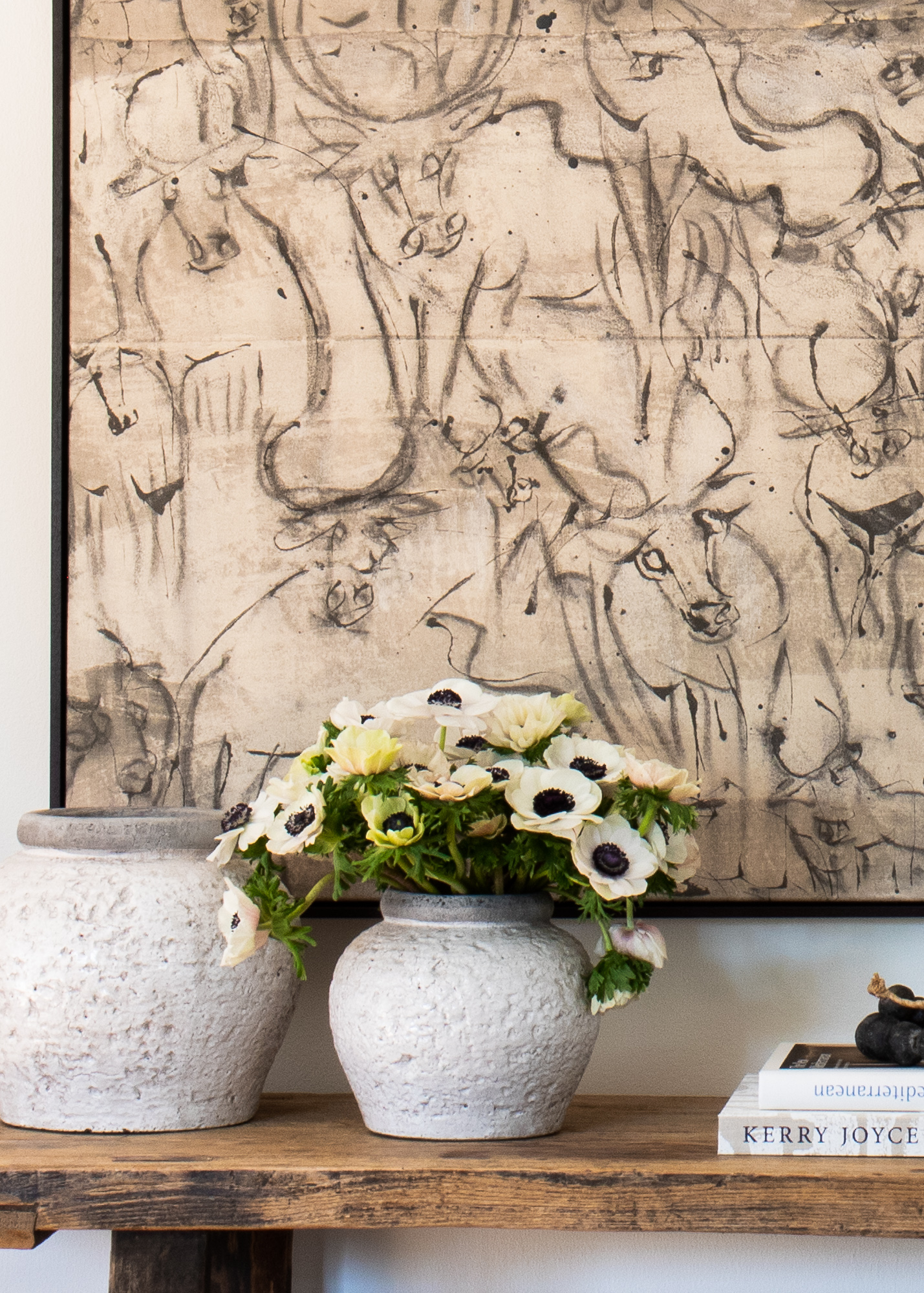
Large pot // Short Pot // Book // Beads
THE MAIN DINING ROOM
Up next, the formal dining area! As you may have already noticed, sourcing vintage Italian farmhouse furniture is my jam, and this table + bench combo came from a little village in Tuscany. How can you not be obsessed with this moment?
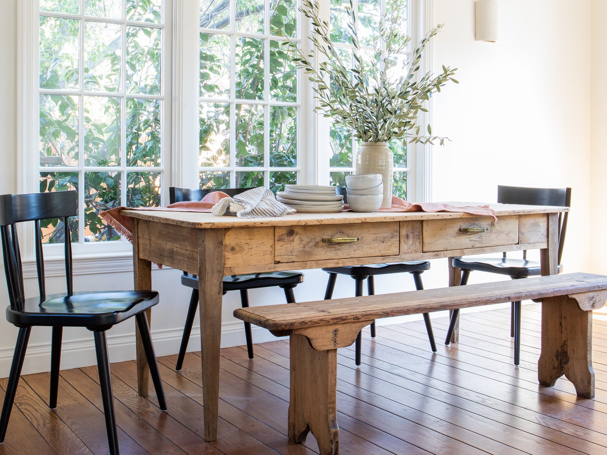
Chairs // Bench & Table (vintage) // Bowls & Plates // Vase // Sconce //
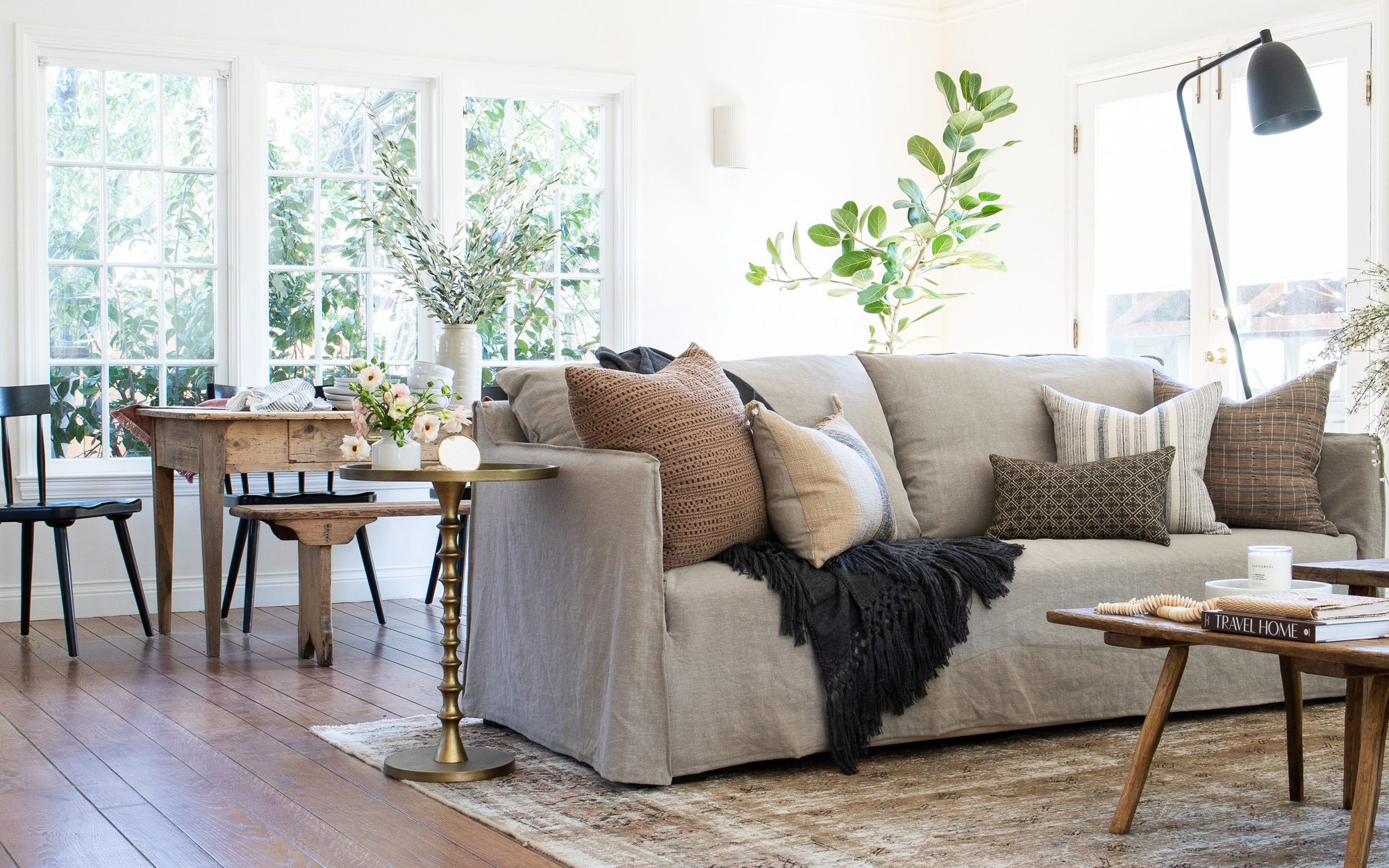
I love the look of mixing seating options, especially in a more narrow space like this. The visual weight of this Windsor-style chair grounds the look, while the bench keeps the flow feeling light and open.
Guys, how beautiful does that dinnerware set look? Any guesses on the source? Target! We had several people inquire about them on the day of the shoot, and yup, Target.
THE MAIN BREAKFAST NOOK
The lucky future owners of this unit have not one but TWO dining options to choose from. The breakfast nook lives just off the kitchen, in a charming angular room that might be a tad too roomy to be given the “nook” label but nonetheless feels so cozy.
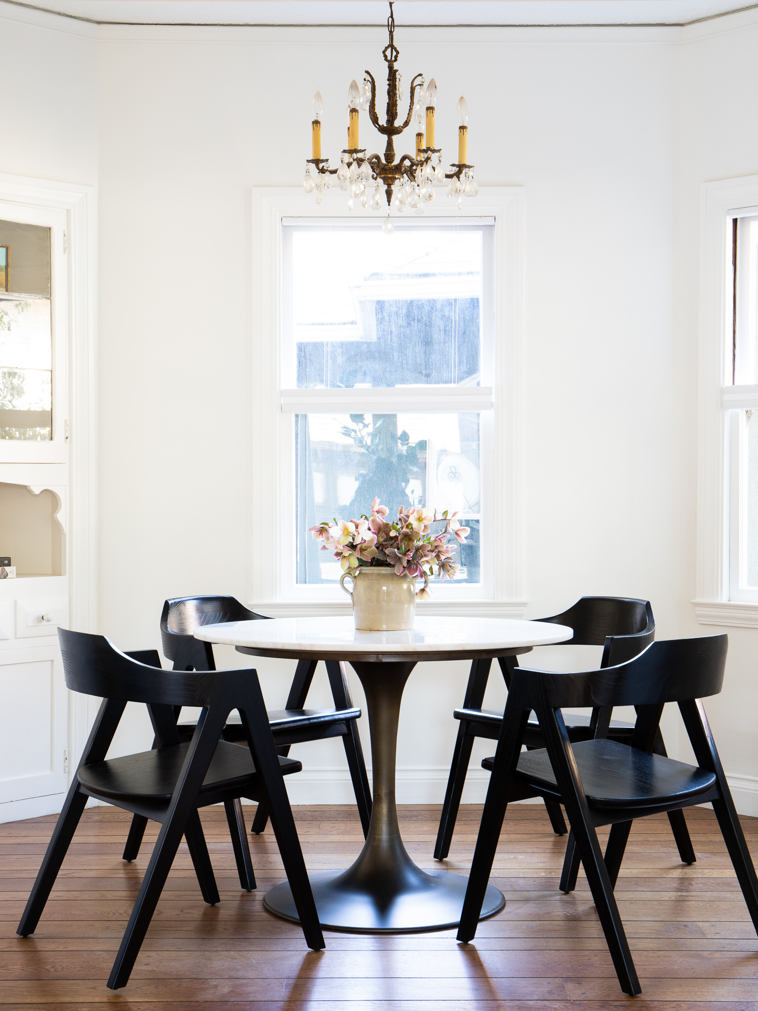
Table // Chairs // Crock (vintage)
The vintage chandelier paired with the modern chairs and antiqued brass tulip table is a combo I didn’t realize I needed in my life. I’m in love with this space! And those build-ins really just get the heart going, don’t they? I really lucked out with this particular developer—he has excellent design taste and I appreciate his commitment to honoring the original architecture of the building. Too often you see residences where the contractor selects builder-grade materials that cheapens and dulls the bones and architecture of the home.
We selected a circular Tulip table that was the perfect scale to keep things feeling open and airy. I love how the patina on the brass base highlights the special vintage details in this room. Against my urge to put vintage rugs in ALL the rooms, I opted against rugs in the dining spaces. Rugs under dining tables are about as controversial as the TV-over-the-fireplace thing. Each space calls for a different look and my gut was telling me no rugs this time.
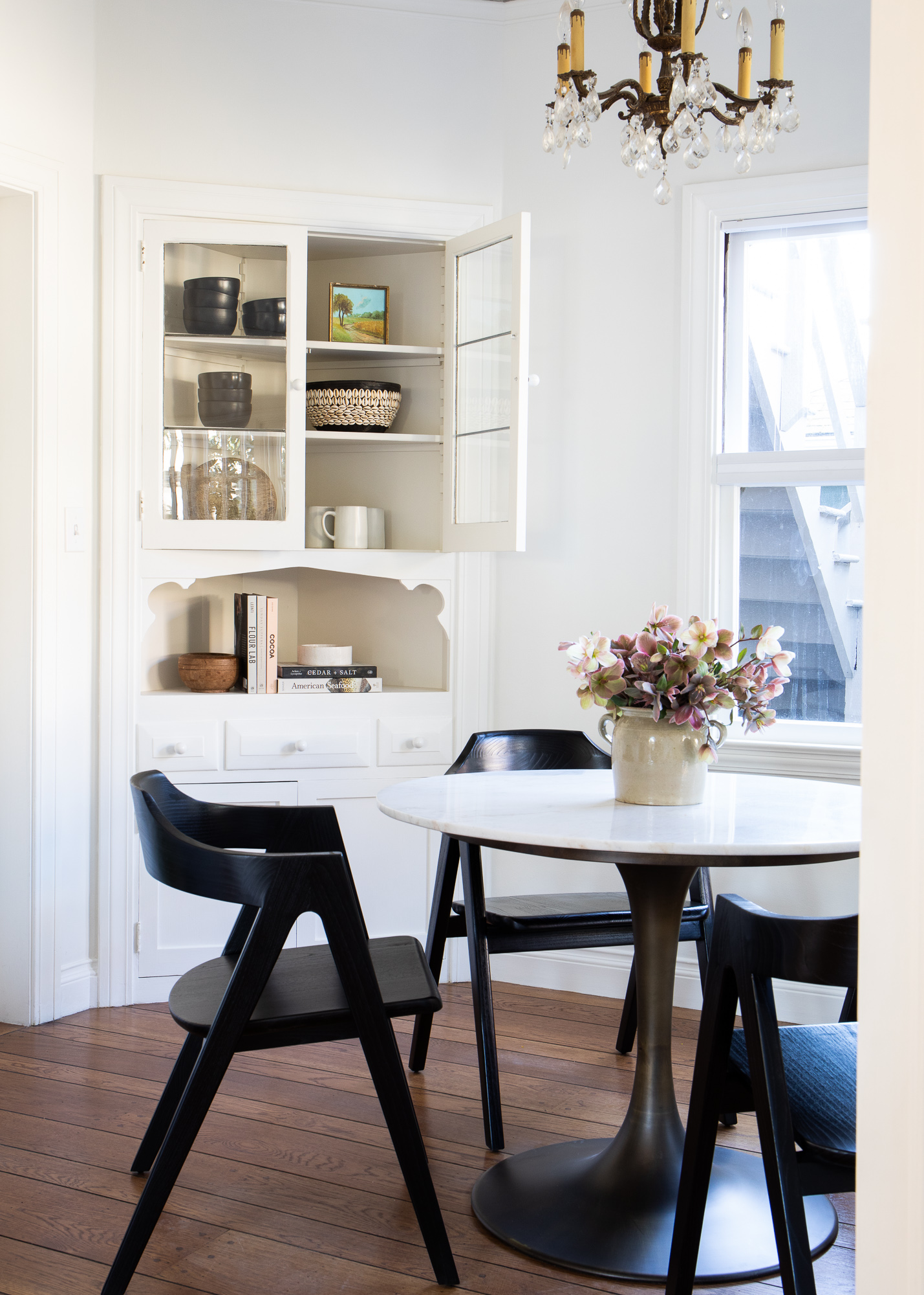
Bowls // Decorative Bowl // Book // Cutting Board
THE MAIN MASTER BEDROOM
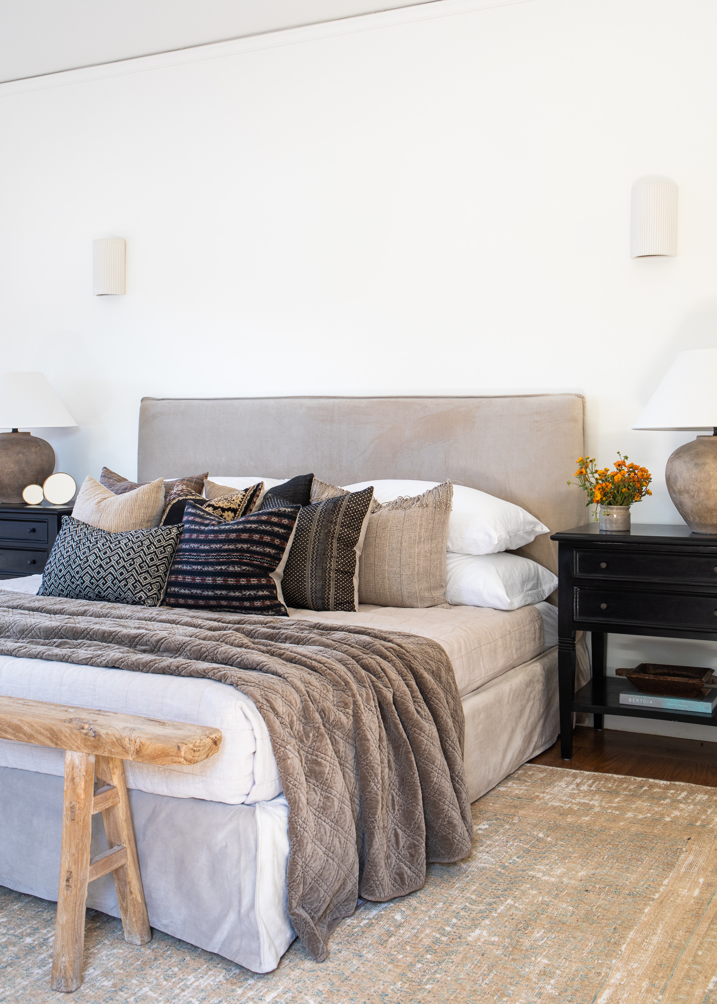
Bed // Mirrors // Rug (vintage) // Pillows // Lamps // Nightstands // Bench (vintage) // Sconces
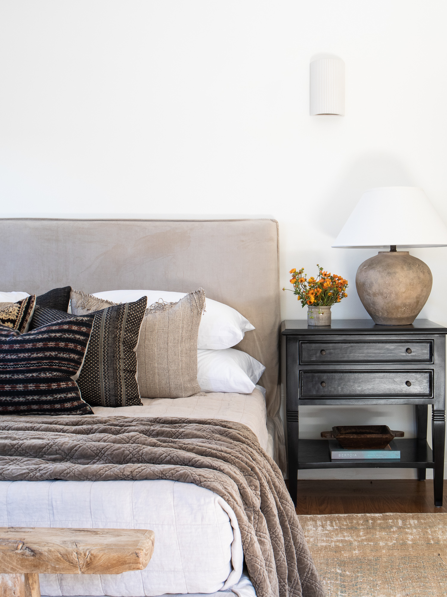
Pillows // Linen quilt // Bowl // Book
In the master bedroom I started the design with two pieces: the rug and the bed. I used the pewter velvet slipcover bed as a rich base to design the rest of the room. Take notice guys! The color palette echoes the living room without being too match-y match-y. Fun fact, I carry this bed frame in our store but in it’s white linen slipcover look. This is our first time using the pewter velvet upholstery and it’s so yummy!
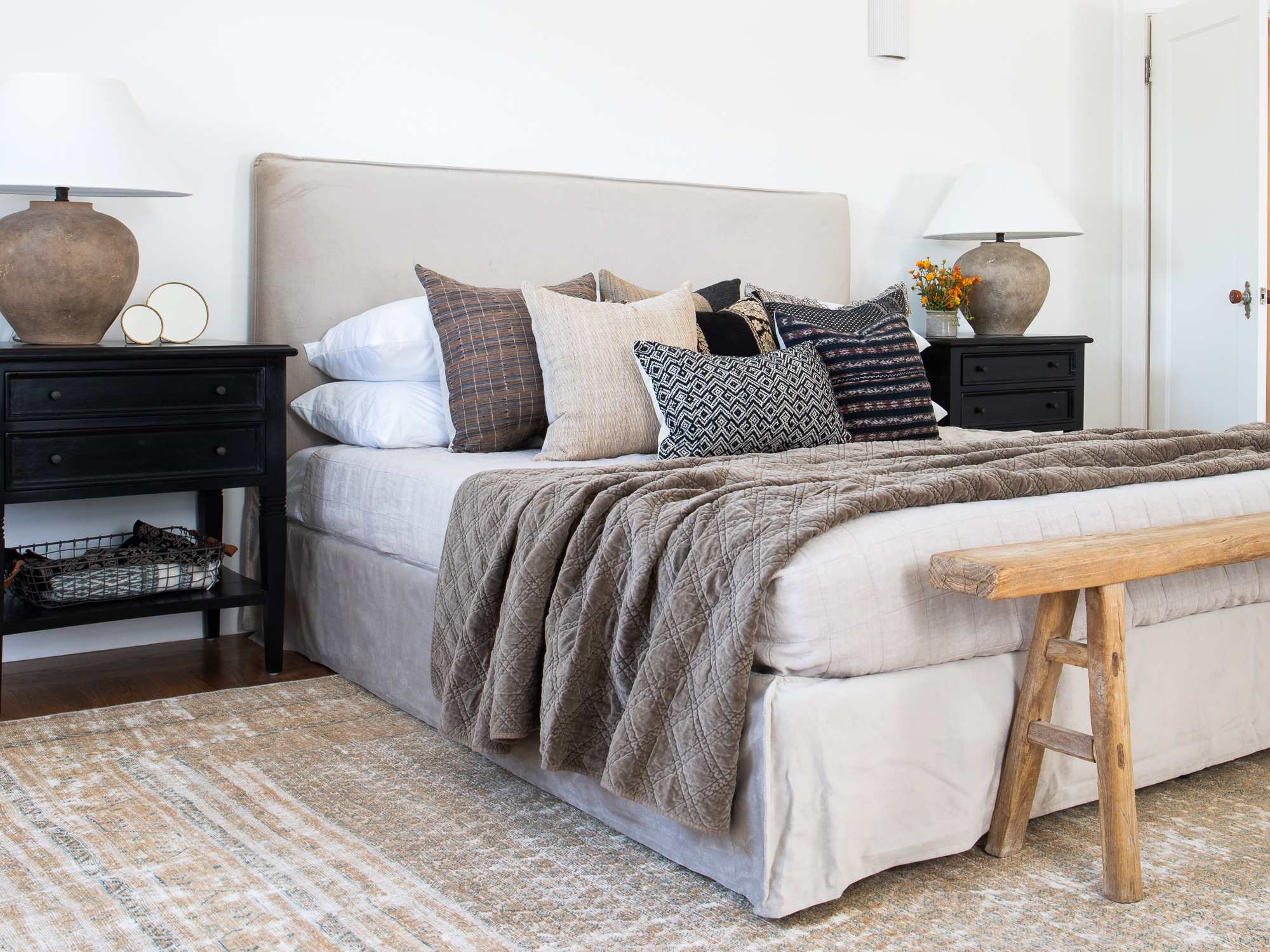
If I’ve learned anything over the last few years, it’s that there are a million and one ways to make a bed. This is look I dub, “the messy made,” where you ever-so-lightly toss a coverlet or quilt on top of the main bedding in a messy fashion. I did a bit of tone-on-tone with this velvet coverlet, which pulls in the darker notes of the pewter bed as well as the neutrals of the rug. I capped off this bed get-up with a reclaimed bench, which gives the eye a break from all the beige tones.
The bed faces a fireplace (dream!) and the bedroom itself is large enough to accommodate multiple zones, and I’ve always loved the look of sitting chairs next to a fireplace. The sherpa upholstery on these chairs is especially cozy.
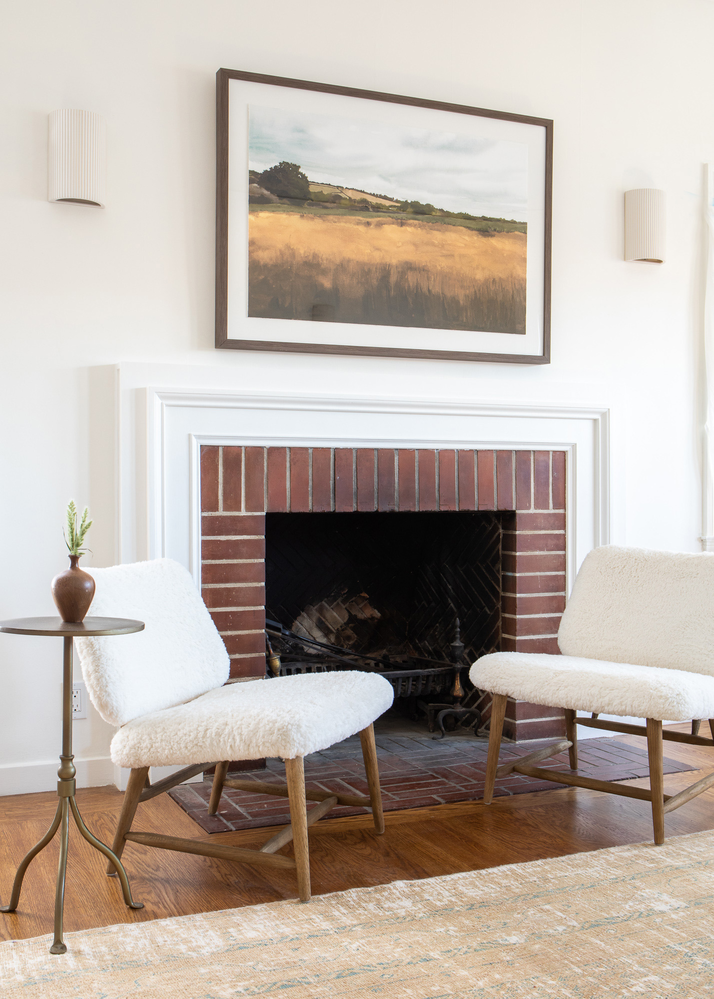
Side Table // Chairs // Art // Sconces
THE MAIN GUEST BEDROOM
In the guest bedroom, I used the same Amelie Bed, but styled it to be a bit more playful. Here, the vintage rug was the first thing I sourced, weaving in the rich berry highlights and deeper marine tones into the bedding.
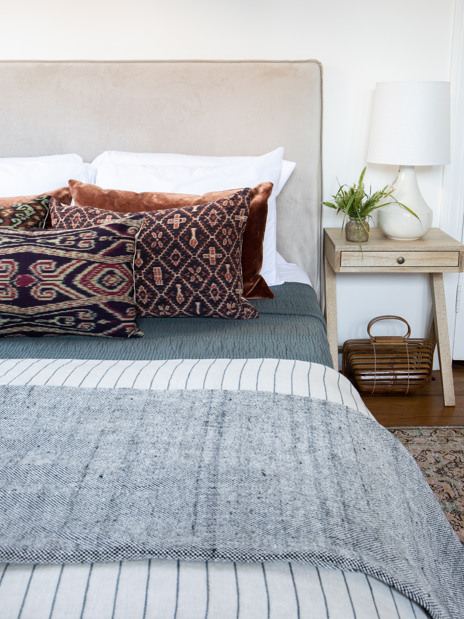
Nightstand // Lamp // Pillows // Blanket // Bed frame // Rug
We went big on the layers with this bedscape: a coverlet a striped duvet (new items hitting the shop soon!), and a pom pom blanket all working together to create a warm look. That purse is a find I scored from my friend Lauren (IG: @Lauren_martin_moro) at a pop-up last year in LA. I love the visual texture it brings to this room.
THE MAIN KITCHEN
Last but certainly not least, the kitchen to end all kitchens! This beauty of a space was really something to behold, and definitely proved to be a fun styling challenge. The far side has entirely open shelving so we had lottttttts to work with. This was the first project that made me realize I NEED to hoard more styling accessories!
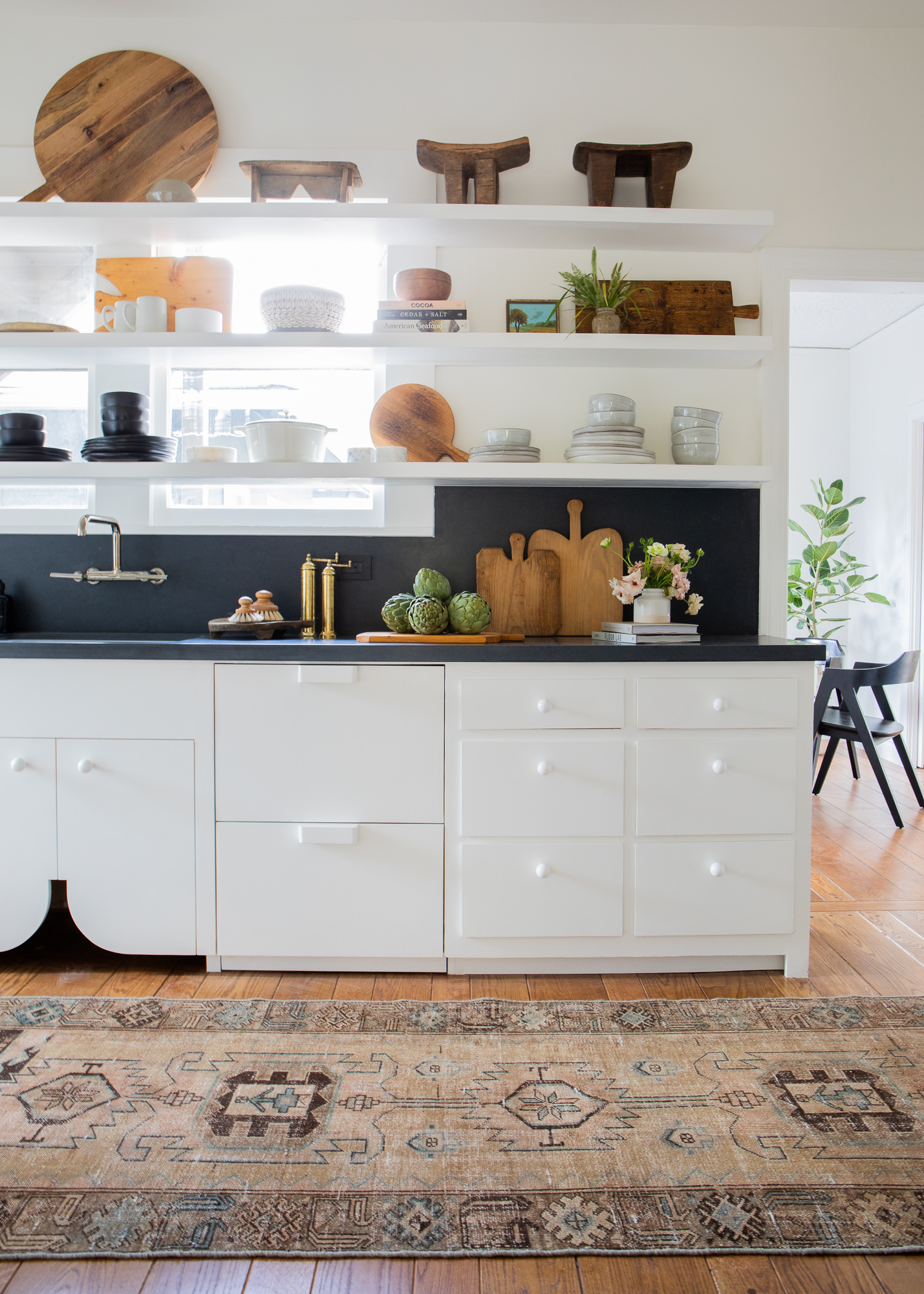
Runner (similar) // Cutting board // Dishes // Brass Pepper Mill // Pot Brush // Books
The cabinetry you’re seeing is all original. The team refinished each piece by hand and installed integrated appliances with custom knobs and pulls. I keep asking the developer if he’s taking orders haha.
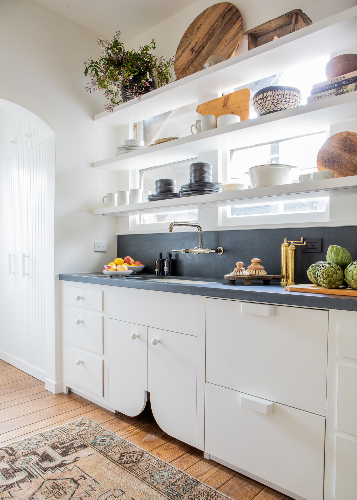
Cutting Board // Mugs // Berry Bowl // Decorative Bowl // Pantry Plate
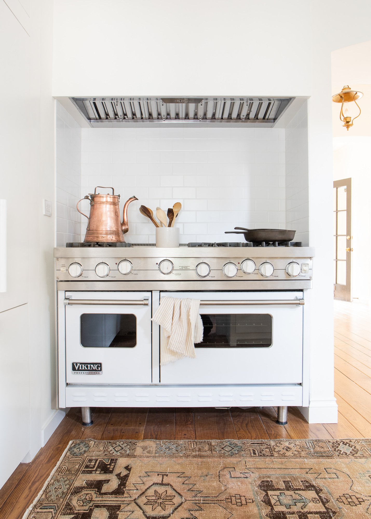
I’m going to wrap things up with the stove-to-end-all-stoves in the kitchen-to-end-all-kitchens! This was a vintage piece found by the developer and lovingly refurbished. Are you dead? I’m dead.
Whew! That was a beast of a post. Thanks for following along and making it to the end.
And finally! For the big surprise!!!
We shared a few sneak peeks of #ManilaVilla on Instagram and your responses blew us away. So many of you were eager to find the sources for each of the rooms. Today we’re thrilled to announce that we’ve made nearly ALL of the pieces from this project available as a part of a special collection on The Vintage Rug Shop online store!
Over at the storefront, we’ve slowly expanded our footprint to include more whole home furnishings, but this is the first time we’ve been able to offer a comprehensive collection online for non-locals. I love knowing our readers and customers live all over the world, and it makes this launch feel even more special knowing that now we can bring this level of product from The Vintage Rug Shop into each of your homes.
PS! Next week we will share Manila Villa Part 2. We’re gonna pack the whole upstairs reveal—that’s TWO UNITS, folks!—into one post.
Be well. And see you next week!
)
)


Utterly stunning. It looks effortless. We all know how hard that is to pull off. Truly well done!
It’s all beyond gorgeous! I can see why you were hired in the spot!
Wow Brittany! The whole project is just stunning. Your styling and decor choices are perfect. Your hard work definitely paid off.
Beautiful! Thank you for sharing your talent with us!
So excited for you/us!! I love the vintage rug shop & your style. The Manila developer was brilliant to bring you in. I’m a local realtor and done a couple flips nearby. Excited to see the Manila units live. Congrats!!
In love with the entire project! The developer made a fantastic choice with you. You did an outstanding job and can’t wait for the second reveal. Congrats Brittany 💖
Absolutely GORGEOUS!!!
I so enjoyed reading this and and taking in all the beauty- your future is going to explode- be ready- you are a Queen albeit very humble of your interior design. Wowsa!!
OMG you are way too kind!!! Seriously! Thank you!
You have impeccable taste! Everything is stunningly gorgeous. I have no doubt those properties will be a success because of you. Congratulations!!
Thank you Alina! It means so much!!
Your work is amazing, Brittany! I’ve loooved following along with this project!! Thanks for the little escape today. I needed it ❤️
Aww, thank YOU for taking the time to read it all! I am happy it offered you this!
Wow – absolutely love everything about it.
Thank you Sara!
You are so talented. I’ll take Manilavilla in a heartbeat.
Thank you!!! And I feel you, the property is so good!
AMAZING as always! Already earmarked so many of the fabulous pieces you used for future home updates. Look forward to seeing you in the store when it reopens. xx
Thank you Tracy! And we DEFINITELY need to schedule your project too!
Breathtakingly beautiful! You see you in every part of this reveal and love how it speaks so clearly to the 1900 space and again with your own voice. Congratulations and can’t wait to shop!
Thank you thank you!!! Means a lot!
Brittany,
This was the first thing I looked at when I woke up. Such an incredible space you designed, congratulations! All of your hard work is going to pay off, it was KILLA for sure!