)
)


You know that thing called “time”? Well, a lot of it has passed since the last #ProjectMyKindaKitchen update, and it’s time for a refresh! (Links to the previous posts are at the bottom of this post.)
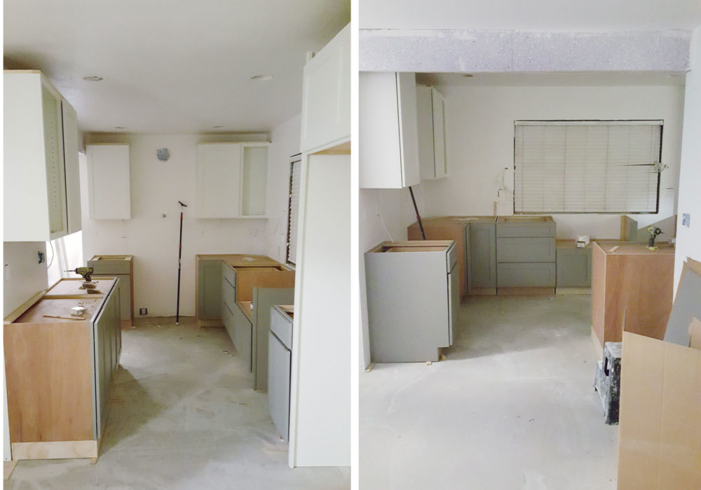
My clients are a young couple who now own and live in the wife’s childhood home, and they were looking to make major changes to the home to suit their style and needs. They started making small updates to the bedrooms, then more significant updates to the bathrooms, with the biggest overhaul being their kitchen and living room – basically where they spend 90% of their time. This was the kitchen before:
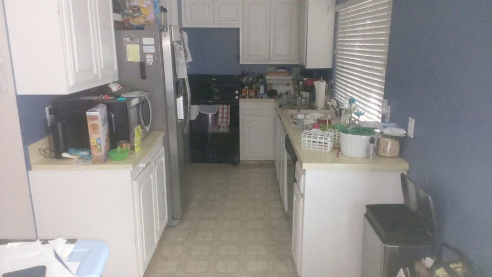
As you can see, not a great use of space and the kitchen workflow was terrible, not to mention barely any usable counter space. Storage was also significantly lacking. The couple asked me to help them with designing a new layout, solve their counter space and storage needs, and help them select all finish materials. Lucky for me they both have excellent taste and selecting the final finishes like tile and counters went very smoothly. It always helps with the design process when your clients know what they want!
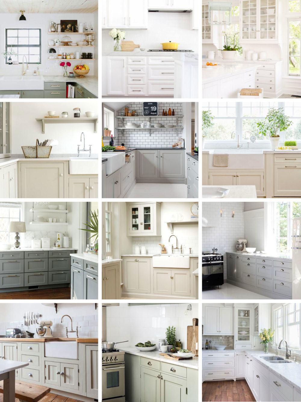
At the inspiration phase, my clients were drawn to kitchens that felt bright, light, calm, open, airy. They wanted that modern farmhouse feel but tamed with modern elements like painted shaker cabinets and subway tile.
The last time I posted, I shared the demo process right up until the cabinets were installed.
Selecting cabinets for a kitchen is daunting. It’s a permanent decision for most folks, one you definitely want to get right the first time. This is why it’s important to weigh your options, do your research, order samples, check your budget etc – to determine what the best option is for you and your kitchen. We spent so much time weighing the options for cabinetry in this kitchen, and ultimately landed on CliqStudios prefab cabinets. Read more about how we decided on these cabinets here.
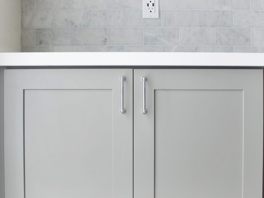
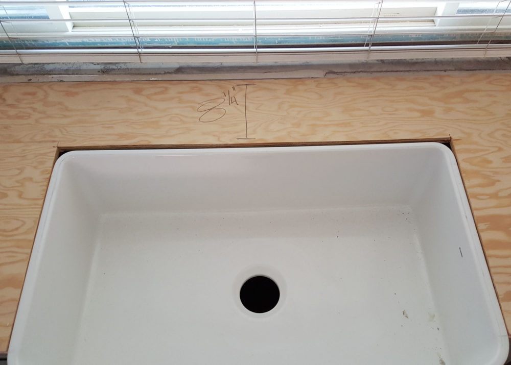
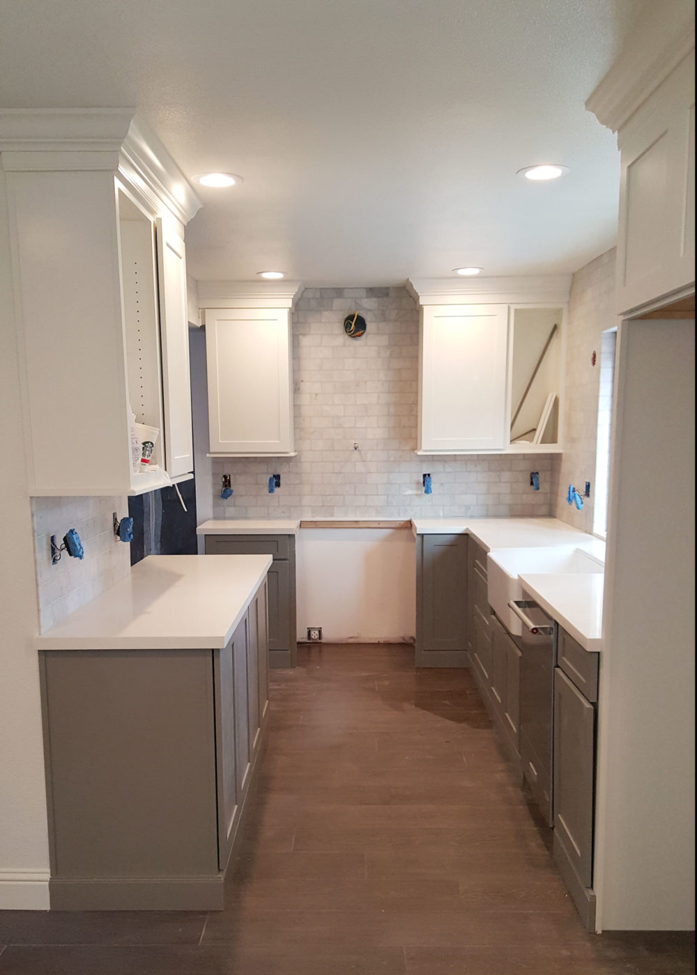
The next step was installing the counters. My clients loved the look of marble, but preferred a counter top that was low maintenance. They decided white quartz was the best choice for their needs since it is exceptionally durable and perfect for a young family.
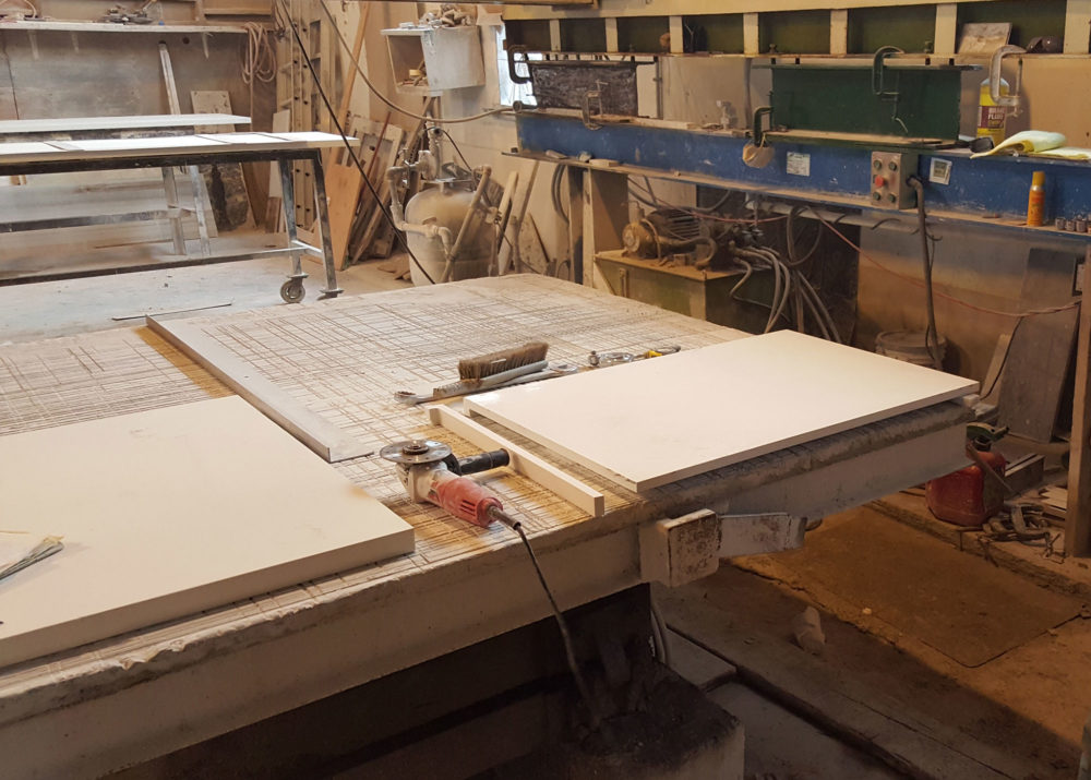
Quartz is a great option for counters as it mimics the look and feel of natural stone, and is essentially maintenance proof. I love how clean and polished the counters look in this kitchen!
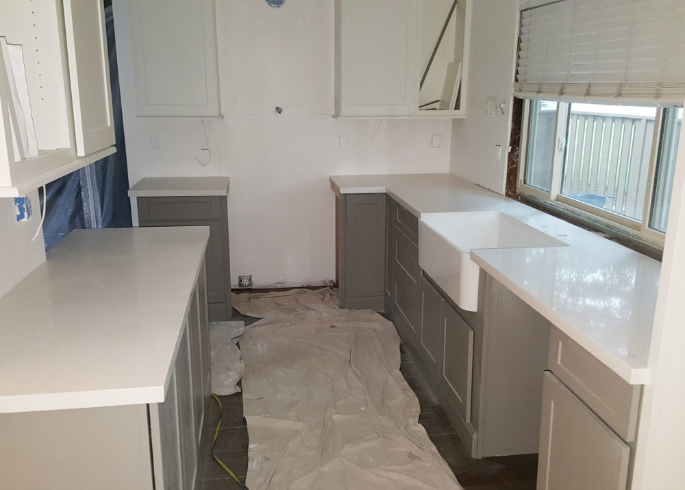
Additionally, we were able to get the marble they wanted by selecting carrera subway tile for the back-splash, which we laid all the way up to the ceiling!
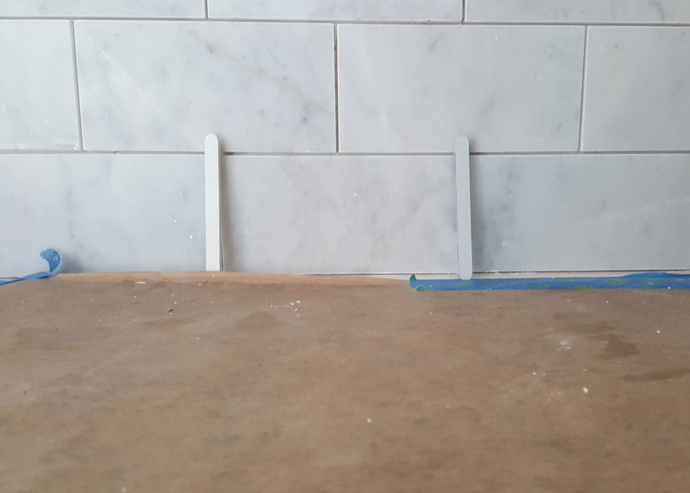
We selected the light gray grout to the right, which matches perfectly to the marble tile.
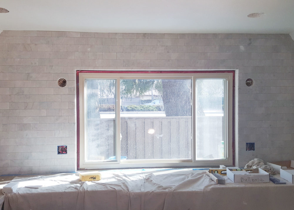
We also laid the marble subway tile against the back peninsula wall, to continue the flow throughout the room.
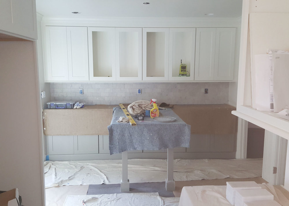
I love how everything took shape once the counters and back-splash were installed! I can’t wait to share the reveal – it’s so good!
*CliqStudios has partnered with us on this project by offering us a discount for sharing our story on the blog. CliqStudios couldn’t have been more of a dream to work with and I am thrilled to share our experience. This post is three of a four-part series with CliqStudios.
Need to catch up? Check out the kitchen before photos here, the design process here, the floor plans here, choosing cabinetry here, and the demo here.

Super-Duper blog! I am loving it!! Will come back again. I am bookmarking your feeds also.
Loving this project! When are you posting the final result? Cant wait to check it out and get ideas for my new kitchen:)
P.S. I am totally in love with your kitchen in a previous post, mixing navy and white. It is so chic and the upper white part makes the kitchen looking so big and full of light.