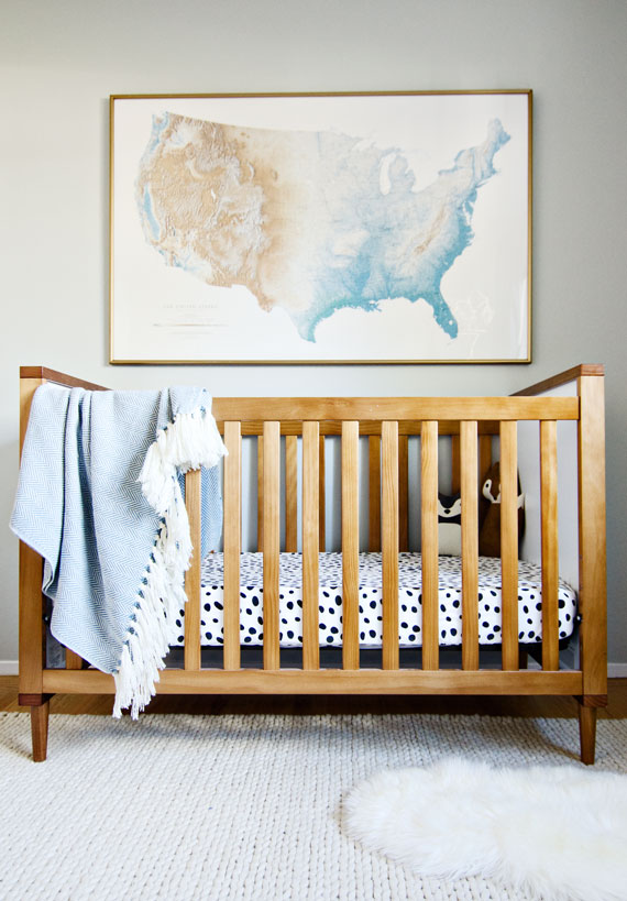
crib // rug // poster (vintage, similar here) // fringe blanket // spotted sheets (Target) no longer avail // flokati // wolf // fox
Truth be told, designing spaces is more hard than it is easy. Sometimes you just know exactly what a space needs, and others, like our nursery, end up being WAY more difficult than expected. I’m having a major design crisis in our nursery. I just can’t seem to finish this space! I know, I know, #firstworldproblems
Let me explain what the issues are here:
1) The room faces north, who would have guessed that a north facing room happens to be the most difficult to decorate? I didn’t go to design school so this is probably a ‘duh’ situation for some of you. I’ve learned most recently (like today! ha!) that you shouldn’t fight the dark light in northern facing spaces, instead, embrace it by using darker hues to invoke drama and intimacy. The other lesson I learned? Definitely don’t paint the walls in tones of greens or grays in northern facing rooms. Well, crap! That’s exactly the tone of paint I used on the walls! A greeny-grey (BM Gray Owl).
2) I put a lot of emphasis on neutrals when originally designing the nursery, now I feel like there’s too much white going on! Like I intentionally voided the space of crazy colors, but now it’s too stark. I can fix this if I paint the walls a different color, which I might do. We’ll see.
3) I’m caught up in not wanting an out-of-the-box themed room but yet wanting to create a space with personality. Zano is the cutest kid, he certainly has a ton of personality (for a 9-month old) but it’s not like I could hold up two paint swatches and ask him which color he likes best! He would probably just take them both and put them in his mouth, or feed them to our pup, Olive.
I’ve felt this way about the nursery for a while, which is why there hasn’t been some big ‘reaveal’, sadly! I’ve been on the hunt for things here and there to layer in some personality. The coolest thing I found was this vintage United States poster at a thrift shop in Monterey. It’s a funny story, we were actually having dinner across the street at my favorite (FAVORITE!) restaurant. My husband and his friends were waiting for our table while one of the wives and I ran across the street to the thrift shop before they closed. I saw the poster hanging on the wall, It was marked down to almost free, so I snatched it up before, you know, asking the husband for permission? the poster is HUGE! I definitely did not anticipate how big it was. Oh, did I mention we drove to dinner? I had to cram this framed poster in our car, above the heads of our 3 friends. We all got a huge laugh out of it, except for my husband, he was a little grumpy about it hahaha.
Anyway, long story short, the space isn’t finished but I found this super cool poster which I wanted to share with you. Hopefully, soon, I’ll make some changes now that I know a little more about northern facing rooms which will hopefully be the fix this space needs to be complete.
Happy Wednesday folks!

)
)


Where is that crib from???
it’s the babyletto skip crib! I’ll add sources, thanks for asking!
I think it’s coming along beautifully! And I love that print. But I’m really digging the bedding + throw pattern combo!
Thanks Mallory! there is a production date on the map (forgetting what it reads as I only remember looking at it when I bought it). Such a coincidence that Schoolhouse Electric has a very similar one, so definitely anyone can get this look! The blues and greens are slightly different from the SE one as well. I like both! The one I bought was already framed, in gold too! #solucky
Oh man you are lucky! I think mine will continue to live in the closet until I luck out and find something big enough!
Love the crib and texture. The art is so great, can’t wait to see what else you decide for in here. xoxo
Thanks!!!
It already looks fab in there! That print is amazing, as well as the crib (love) and those spotted sheets! Can’t believe the crib sheet is from target! It might be fun to dye the flokati rug a darker color for a little contrast/color.
So funny you suggest that! I’ve been wanting to try dying a flokati after seeing a few folks dye theirs pink
That is SUCH an amazing find! I love the effect of the colors bleeding into each other.
I had the opposite problem with my nursery…I got too many “pops” of color. I started with white walls and felt that this gave me free reign. I ended up editing out one of the main accent colors in the end.
Thanks Gwen! For so long the room just hasn’t felt *right*, so I started thinking about what might be the reason, then researched paint and light sources.. anyway, i went down the rabbit hole and actually found the answer! (which rarely happens haha)
Love the map! I’ve felt the same way about our playroom, I keep adding and taking away but can’t seem to get it just right!
Oh my goodness I am feeling that same stuck feeling with our office right now! I have no idea what to do with it and my husband thinks I am crazy. I just found your blog today and I am loving it! We are designing and renovating our entire house too so it is fun to see what someone else is doing!!
Leah Faye
lavender & clover
thanks!!! and here’s to figuring out those difficult spaces :)